

A redesigned restaurant discovery experience that makes choosing where to eat easier, more intuitive, and more enjoyable.
OpenTable helps millions of users discover and reserve restaurants, yet the experience often felt overwhelming and transactional. Users struggled to identify places that truly matched their preferences, trust the authenticity of options, and coordinate decisions when dining with others.
This project focused on improving discovery by reducing friction, strengthening emotional engagement, and helping users feel confident in their choices from browse to booking.
Cluttered. Transactional. Uninspiring.
Restaurant discovery required too much effort. Users faced large volumes of similar options, limited signals around authenticity, and little support for group planning. The existing interface prioritized efficiency but lacked warmth and clarity, making it difficult for users to feel excited or confident about where to dine.
We began with empathy driven research to understand how users evaluate restaurants and make dining decisions. Alongside interviews and competitive analysis, we conducted a heuristic analysis to evaluate usability gaps and friction points across the existing experience. These insights revealed opportunities to reduce cognitive load, surface more meaningful cues, and better support group decision making. Early concepts focused on improving hierarchy, visual storytelling, and interaction patterns that felt intuitive in real use.
We conducted a heuristic evaluation of the existing OpenTable experience to identify usability gaps and areas contributing to friction during discovery and decision making.
1. Cluttered discovery experience
Restaurant listings surfaced too much information at once, making it difficult for users to quickly scan, compare, and identify relevant options. This increased cognitive load and slowed decision making.
2. Weak visual hierarchy
Important signals such as availability, cuisine type, and restaurant vibe were not clearly prioritized, forcing users to spend additional effort interpreting listings.
3. Limited system feedback
Filters and sorting interactions lacked clear feedback, leaving users unsure whether their actions meaningfully refined results or improved relevance.
4. Inconsistent interaction patterns
Variations in layout and behavior across screens reduced predictability, requiring users to relearn interactions as they navigated the experience.
5. Decision fatigue during browsing
The combination of dense content, similar options, and limited differentiation led to fatigue and hesitation, especially for users browsing without a specific destination in mind.
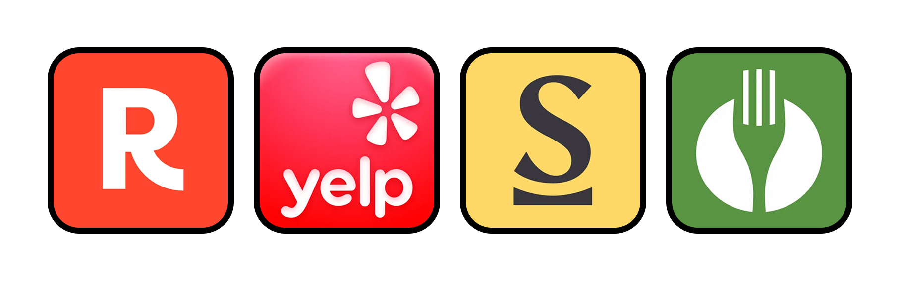
We analyzed leading platforms in restaurant discovery and dining experiences, including Yelp, Resy, Seated, and network driven platforms that influence where users choose to eat. Each competitor excelled in specific areas such as reviews, reservations, rewards, or social influence, but often fell short of delivering a holistic and intuitive discovery experience.
Yelp offered depth through reviews and community feedback but felt dense and overwhelming when browsing. Resy prioritized reservation efficiency and a more editorial tone, though discovery felt limited for users without a clear destination in mind. Seated focused on incentives and rewards, which encouraged bookings but did not fully support exploration or emotional decision making. Social and network based platforms influenced dining choices through visuals and trends but lacked structure and reliability for planning.
This analysis revealed a clear opportunity for OpenTable to bridge the gap between efficiency and inspiration by combining strong discovery tools, emotional cues, and trust signals within a single, cohesive experience. Insights from competitors helped inform decisions around hierarchy, visual storytelling, and interaction patterns that support confident and intuitive dining decisions.
12 in depth interviews
5 socio-economic backgrounds
20 year age range
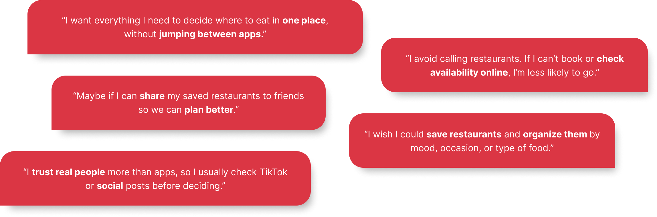
We conducted interviews to understand how people discover restaurants, evaluate options, and make dining decisions individually and in groups. Interviews revealed that users often felt overwhelmed by the number of choices and relied heavily on visual cues, reviews, and contextual signals to build confidence.
Research highlighted a strong need for trust and authenticity during discovery, as well as clearer support for group planning. Users wanted faster ways to narrow options, better signals around vibe and quality, and an experience that felt engaging rather than purely transactional. These insights informed design decisions focused on clarity, emotional resonance, and intuitive decision making.
We synthesized research findings using affinity mapping to identify patterns across user behaviors, needs, and frustrations. Grouping insights allowed us to surface recurring themes around discovery, trust, and decision making. These themes helped us move from individual observations to clear, actionable insights that directly informed design priorities and solution direction.
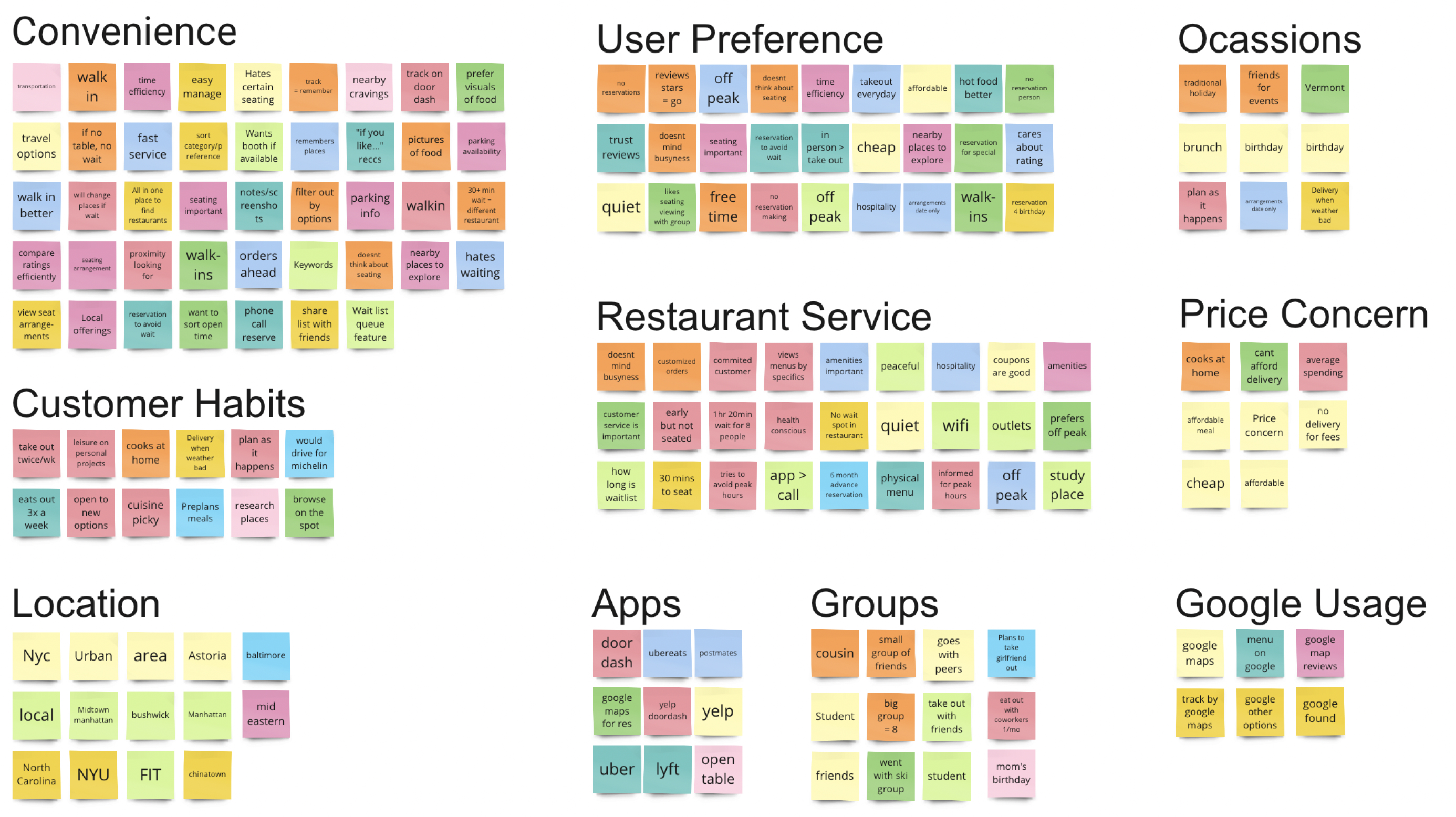
1. Overwhelming restaurant discovery
Users feel overloaded by the number of similar restaurant options and dense information presented at once. Without clear differentiation, it becomes difficult to quickly scan, compare, and confidently decide where to eat.
2. Fragmented decision making across platforms
Reviews alone do not feel reliable or genuine. Users want stronger contextual cues like visuals, social proof, and real experiences to feel confident in their choices.
3. Limited trust and authenticity signals
Reviews alone do not feel reliable or genuine. Users want stronger contextual cues like visuals, social proof, and real experiences to feel confident in their choices.
4. Friction in group planning
Planning with friends is time consuming and unstructured. Users lack simple ways to share, compare, and align on restaurant options that meet everyone’s preferences and budgets.
Using insights from research and affinity mapping, we created personas that represent key user behaviors, motivations, and decision making patterns. These personas helped ground design decisions in real user needs, ensuring solutions addressed both individual discovery and group planning scenarios. Throughout the process, personas served as a shared reference point to align the team on priorities and guide experience decisions.
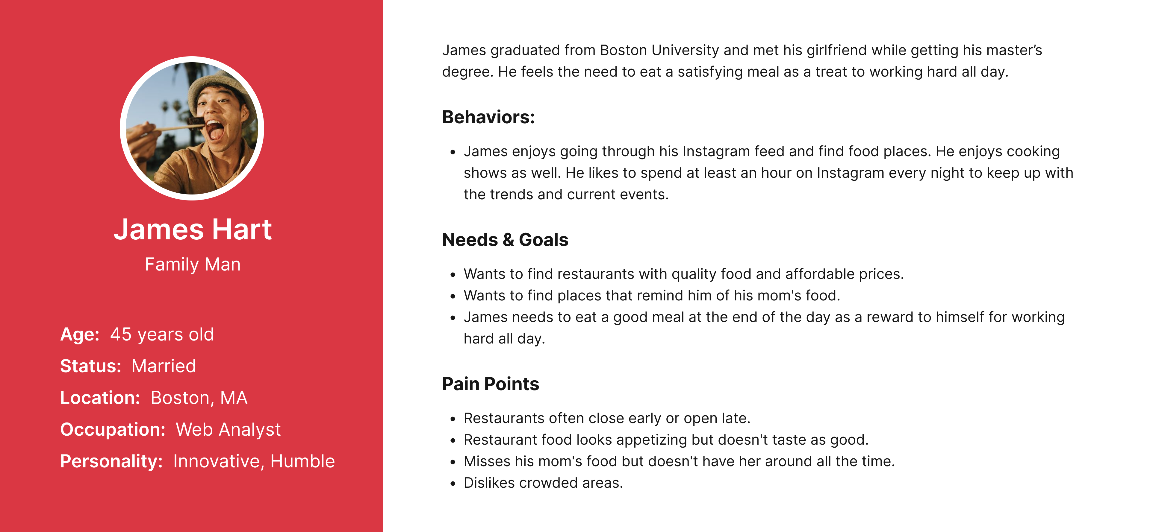
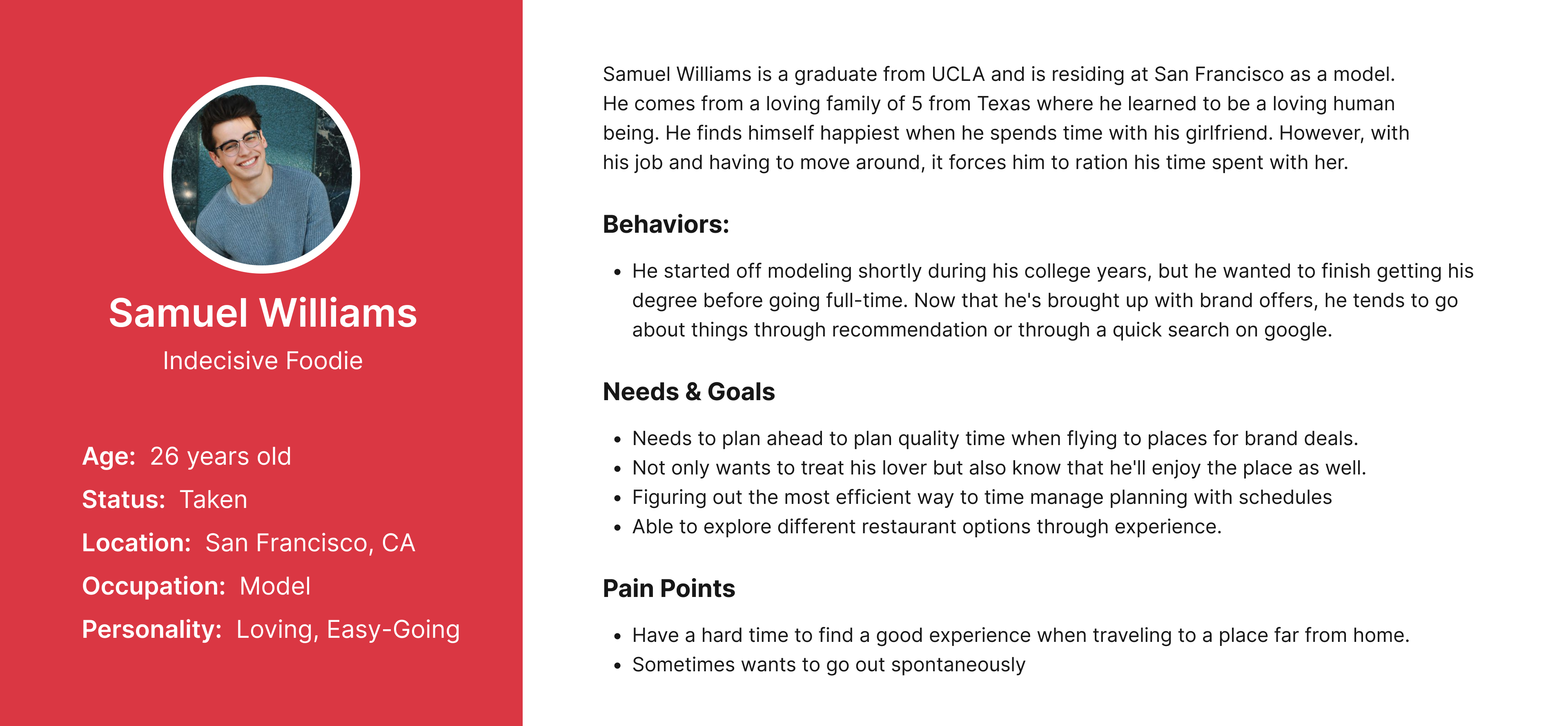
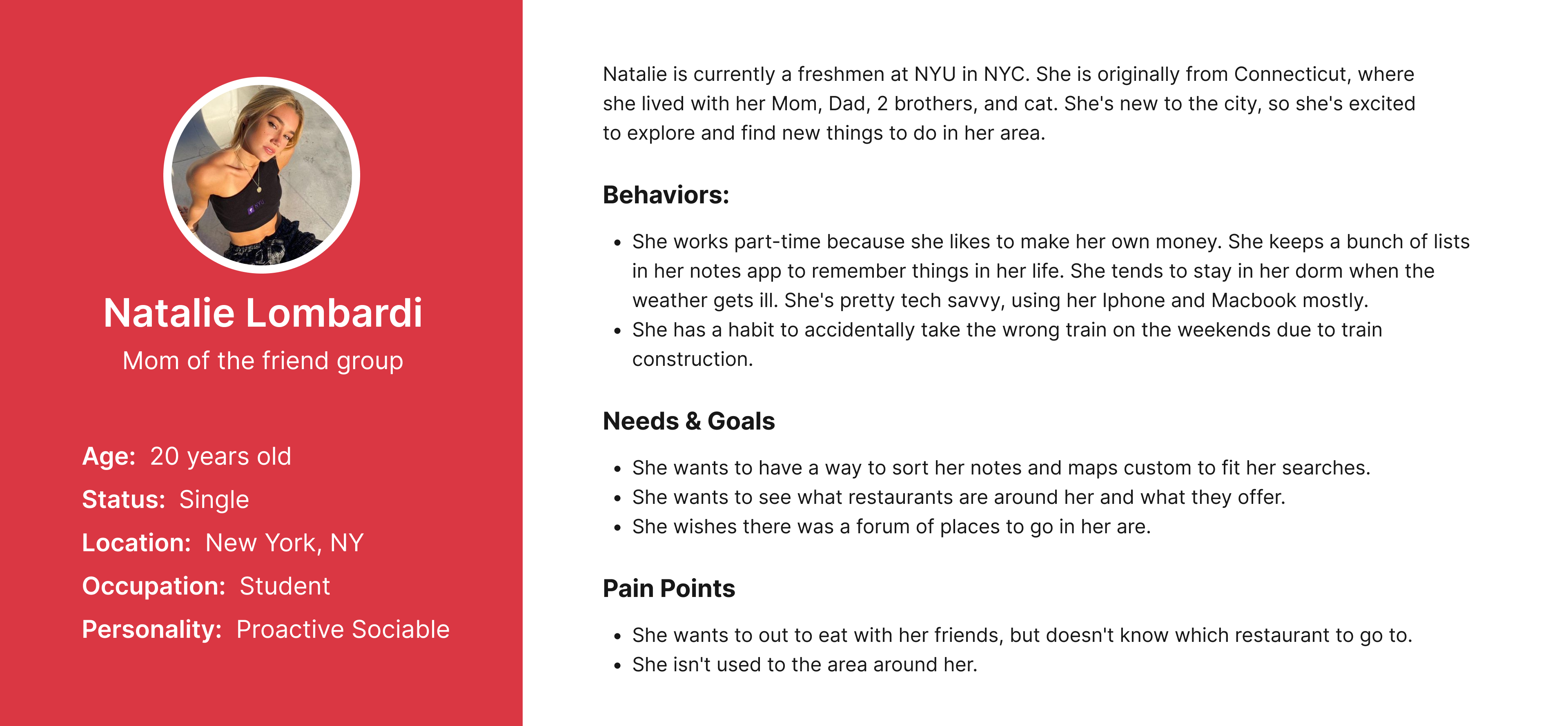
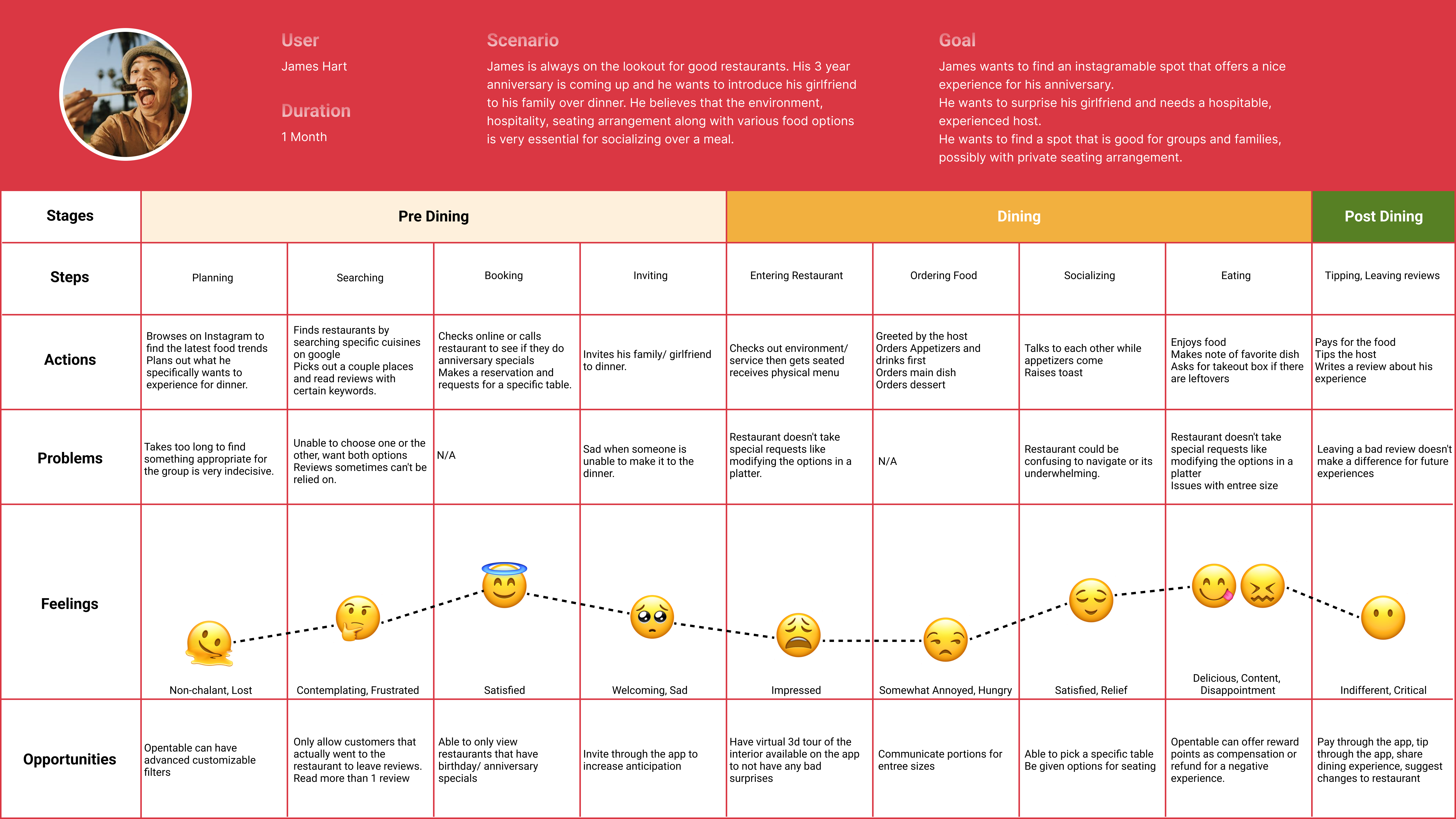
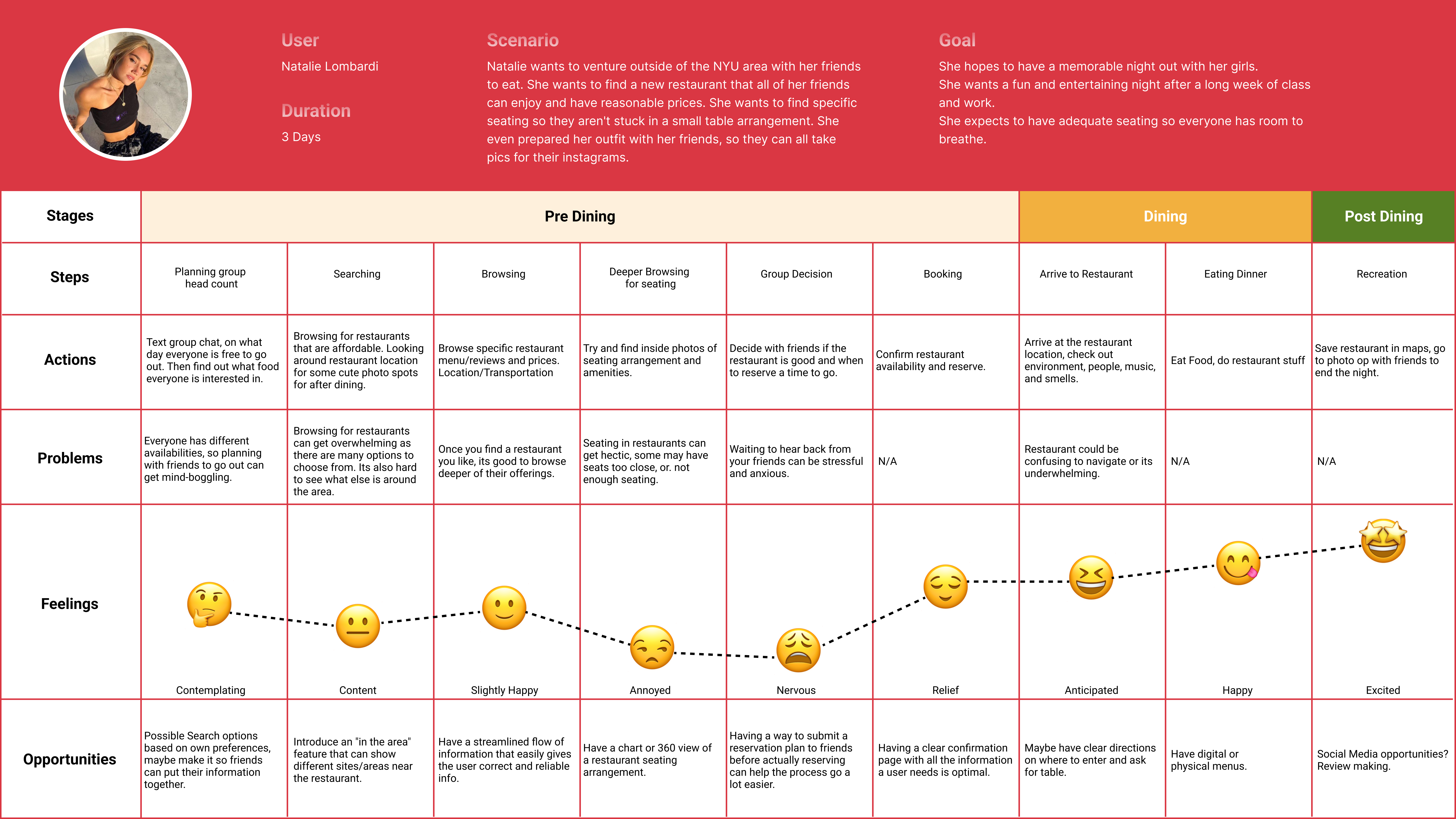
We created journey maps to empathize with the challenges users encounter throughout the dining decision process. Each persona was mapped to a specific goal and scenario, helping us identify key moments of friction and uncover opportunities for meaningful solutions.

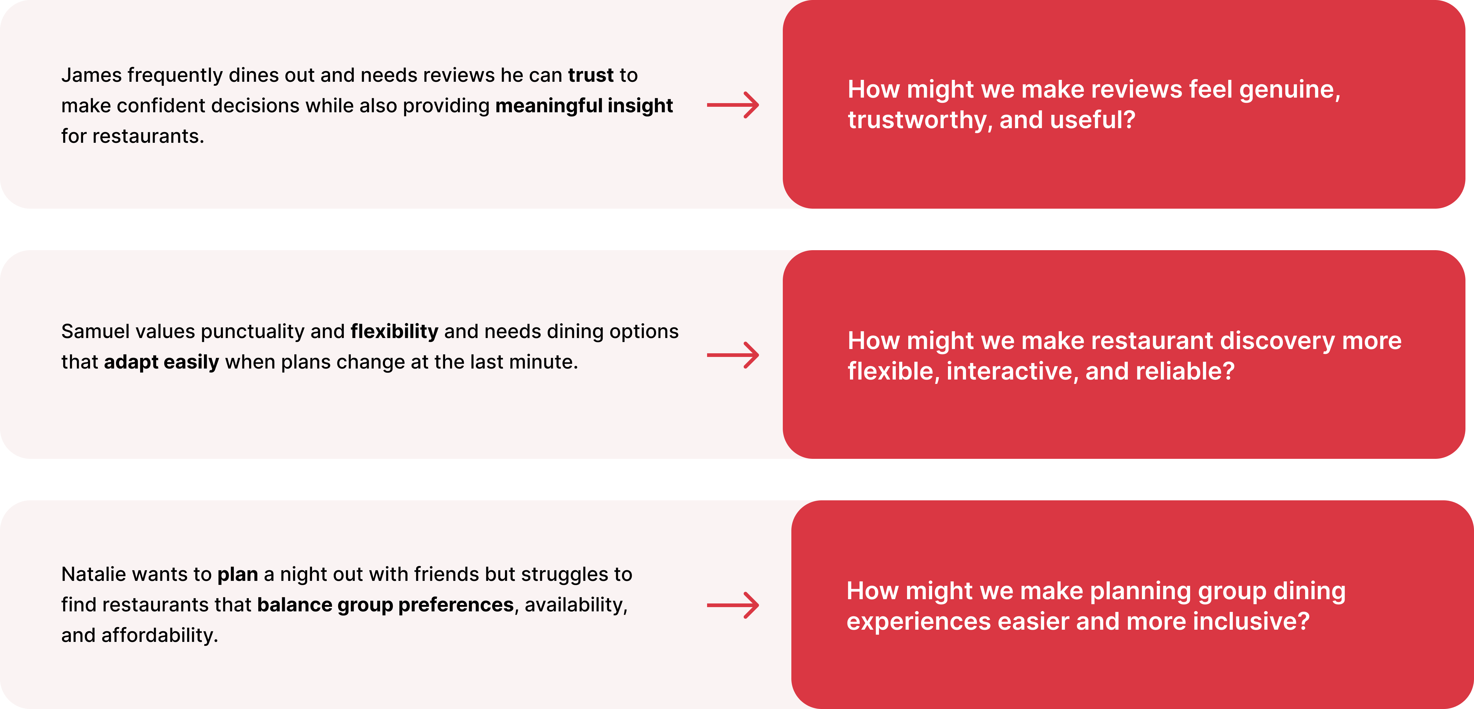
Using insights from personas and journey maps, we defined clear point of view statements to articulate user needs and core challenges. These POVs were then translated into How Might We questions, reframing problems into opportunity areas and guiding ideation toward focused, user centered solutions.
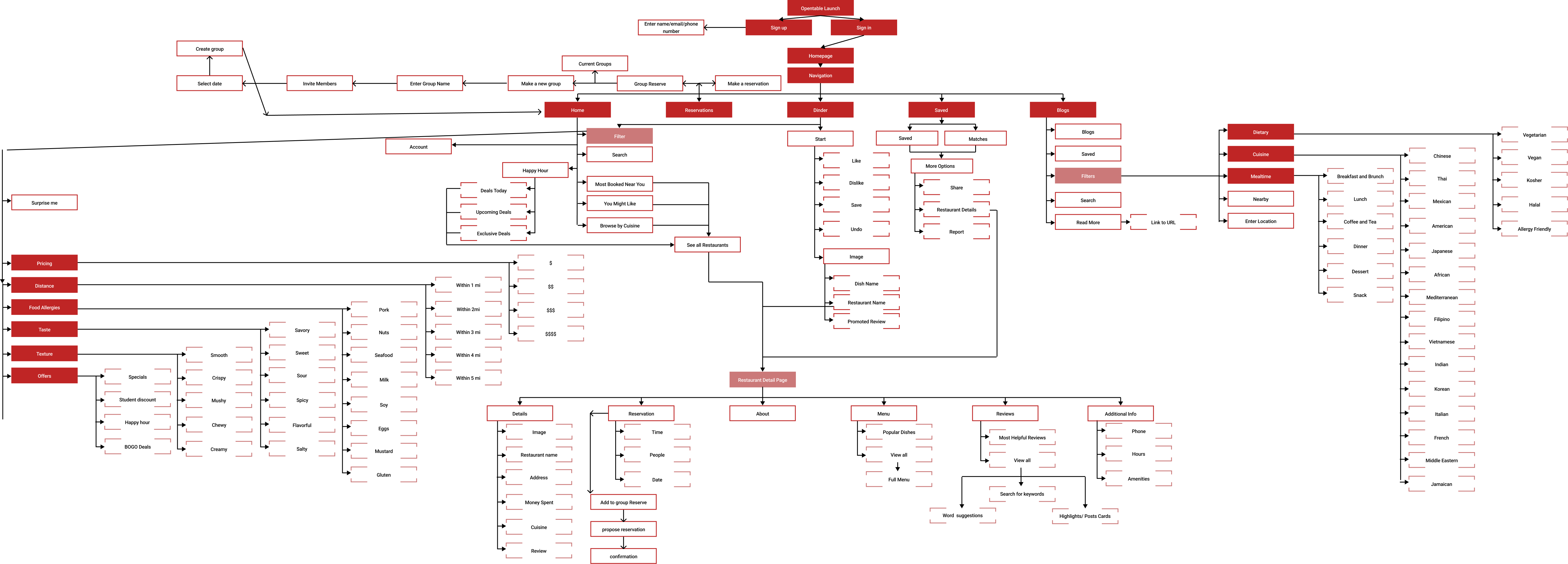
We developed a sitemap and information architecture to organize content in a clear, intuitive way that supports how users naturally search for and evaluate restaurants. By prioritizing key pathways and reducing unnecessary complexity, the IA helped streamline discovery, improve findability, and create a foundation for a more cohesive end to end experience.
We created user flows to map key paths through the experience, focusing on how users move from discovery to decision and booking. These flows helped identify moments of friction, clarify interactions, and ensure each step supported intuitive, efficient decision making across both individual and group scenarios.
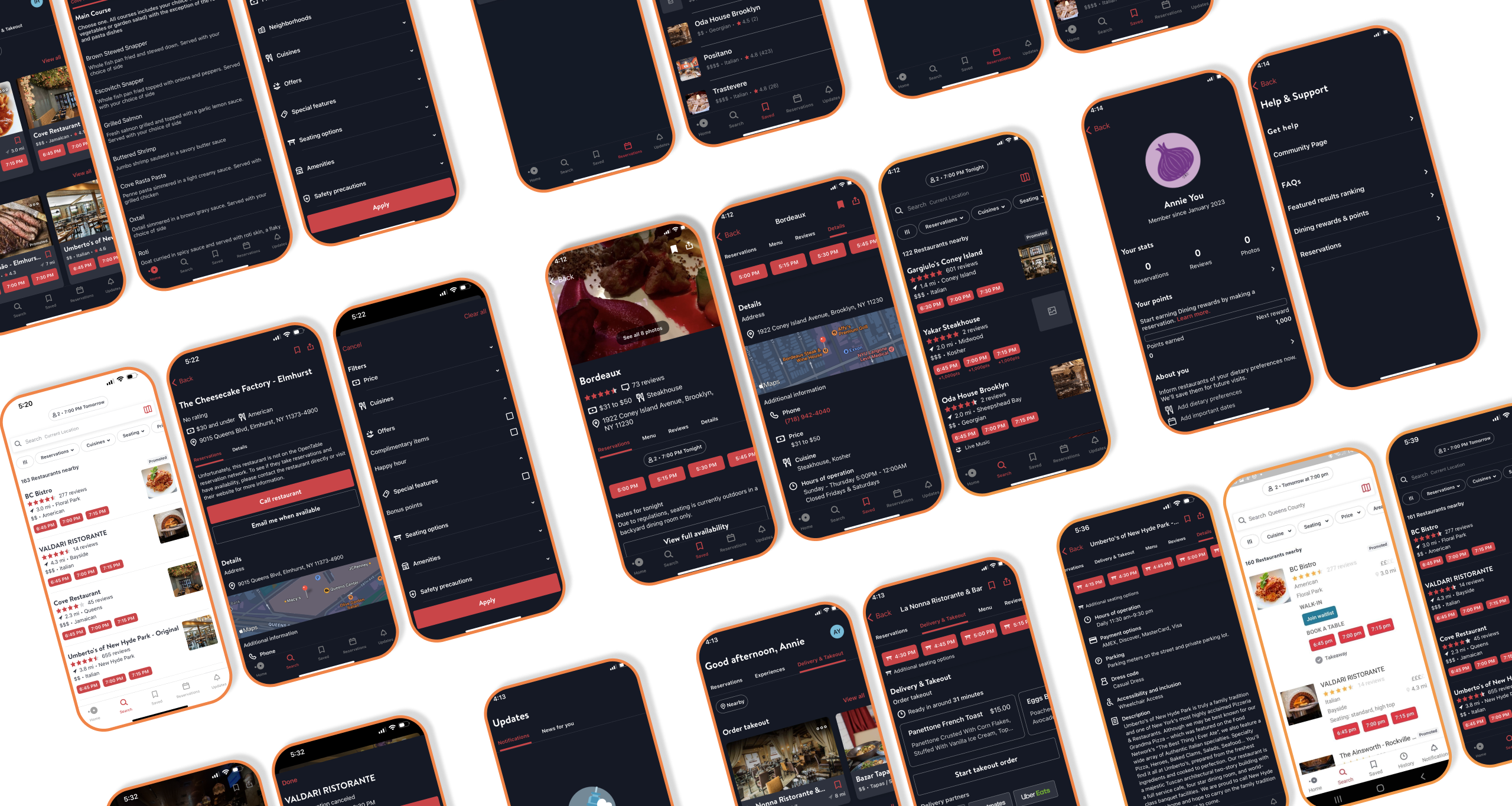
We created low fidelity wireframes and interactive prototypes to explore layout, hierarchy, and key interactions across core user flows. Prototyping allowed us to validate assumptions, test usability early, and iterate quickly based on feedback before moving into detailed design.
1. Visual first discovery drives faster decisions
Users consistently relied on images, menus, and social content to evaluate options before reading detailed information. Visual cues helped build confidence and reduced time spent comparing restaurants.
2. New interaction patterns need stronger cues
Innovative features like swipe based browsing and socially sourced reviews were engaging, but users needed clearer onboarding and feedback to understand intent on first use.
3. Consistent feedback builds trust
Users expected immediate confirmation when actions were taken, such as saving, filtering, or swiping. Missing or subtle feedback caused momentary hesitation and uncertainty.
4. Group planning benefits from clearer decision states
While collaborative features were appealing, users wanted clearer signals around status, confirmations, and next steps when coordinating with others.
Make People Hungry
We use expressive imagery, custom shapes, and warm color to make food feel craveable and inviting.
Welcoming
Rounded type and soft visuals create a friendly experience, balancing familiarity with moments of surprise.
Collaboration
Group features are designed to reduce friction and make planning together simple and seamless.
Inclusive
Information is revealed progressively to support clarity and reduce cognitive overload.
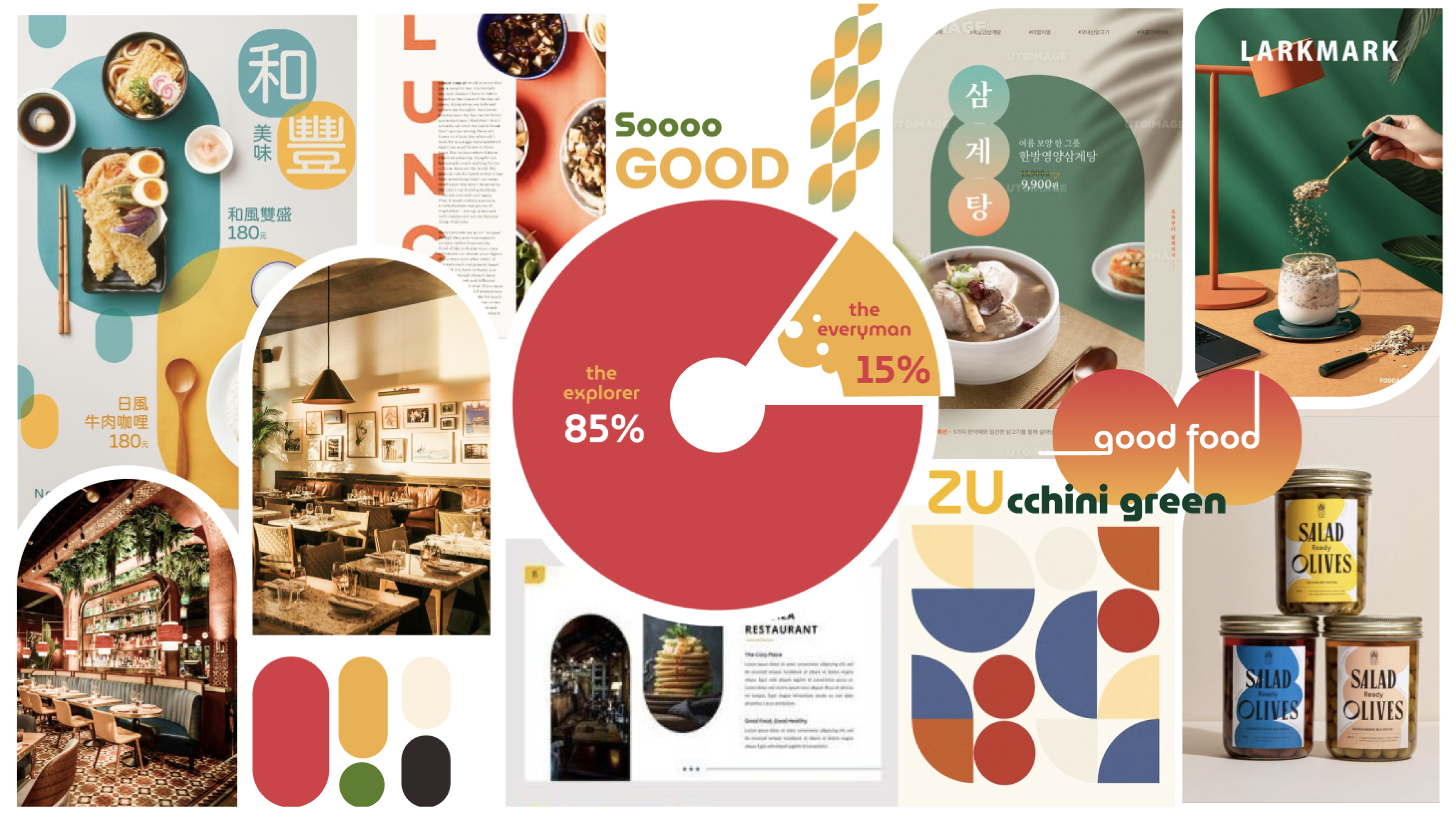
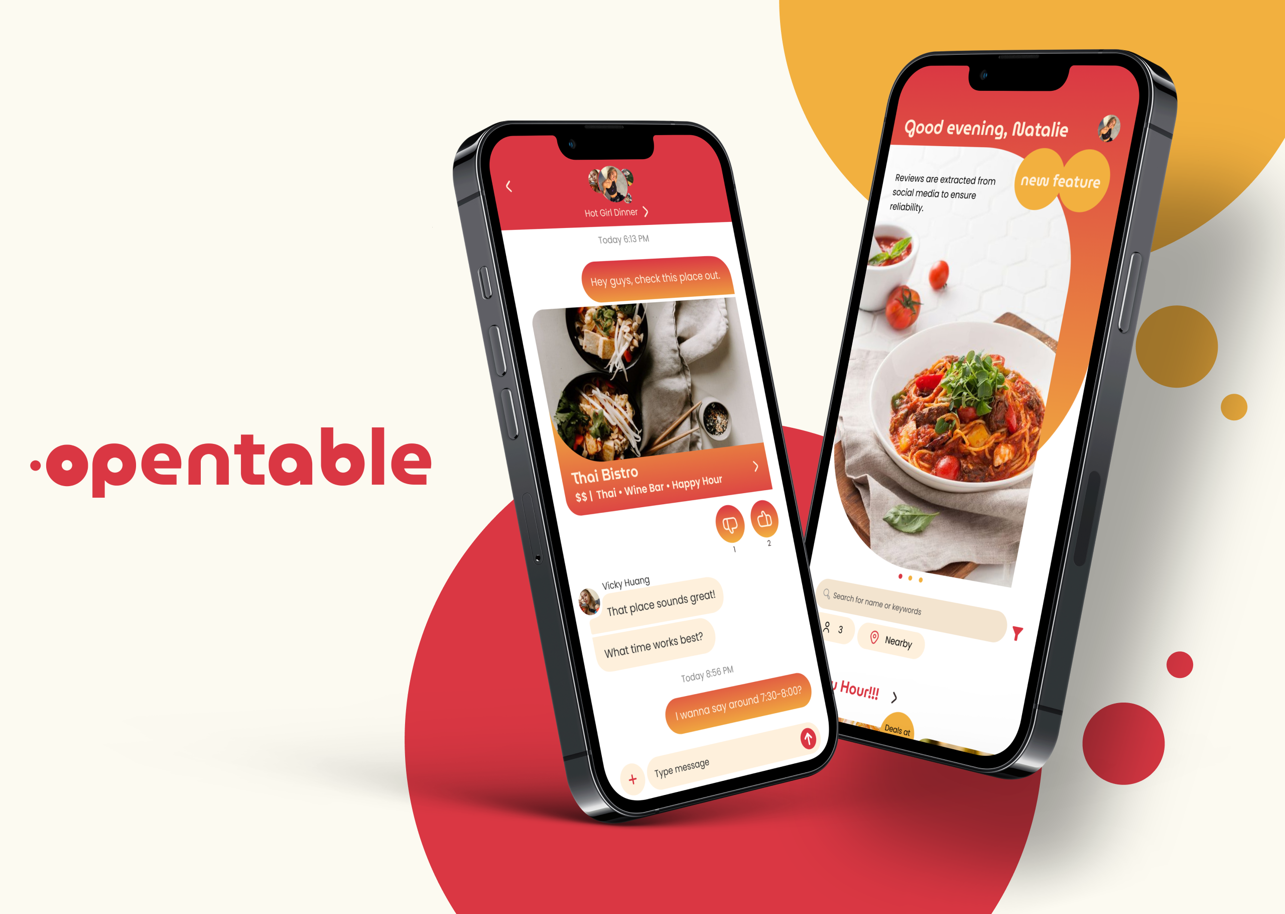
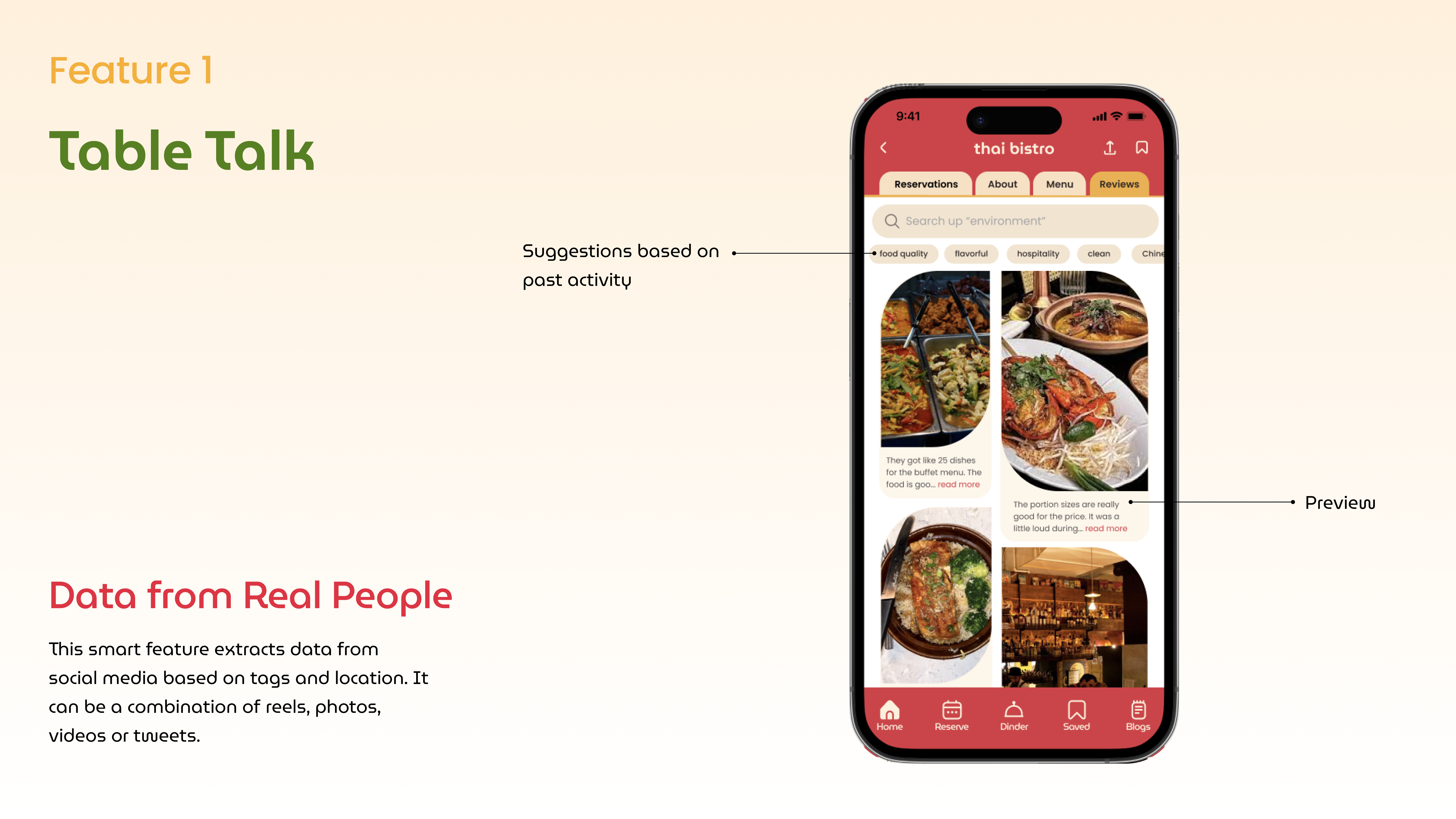
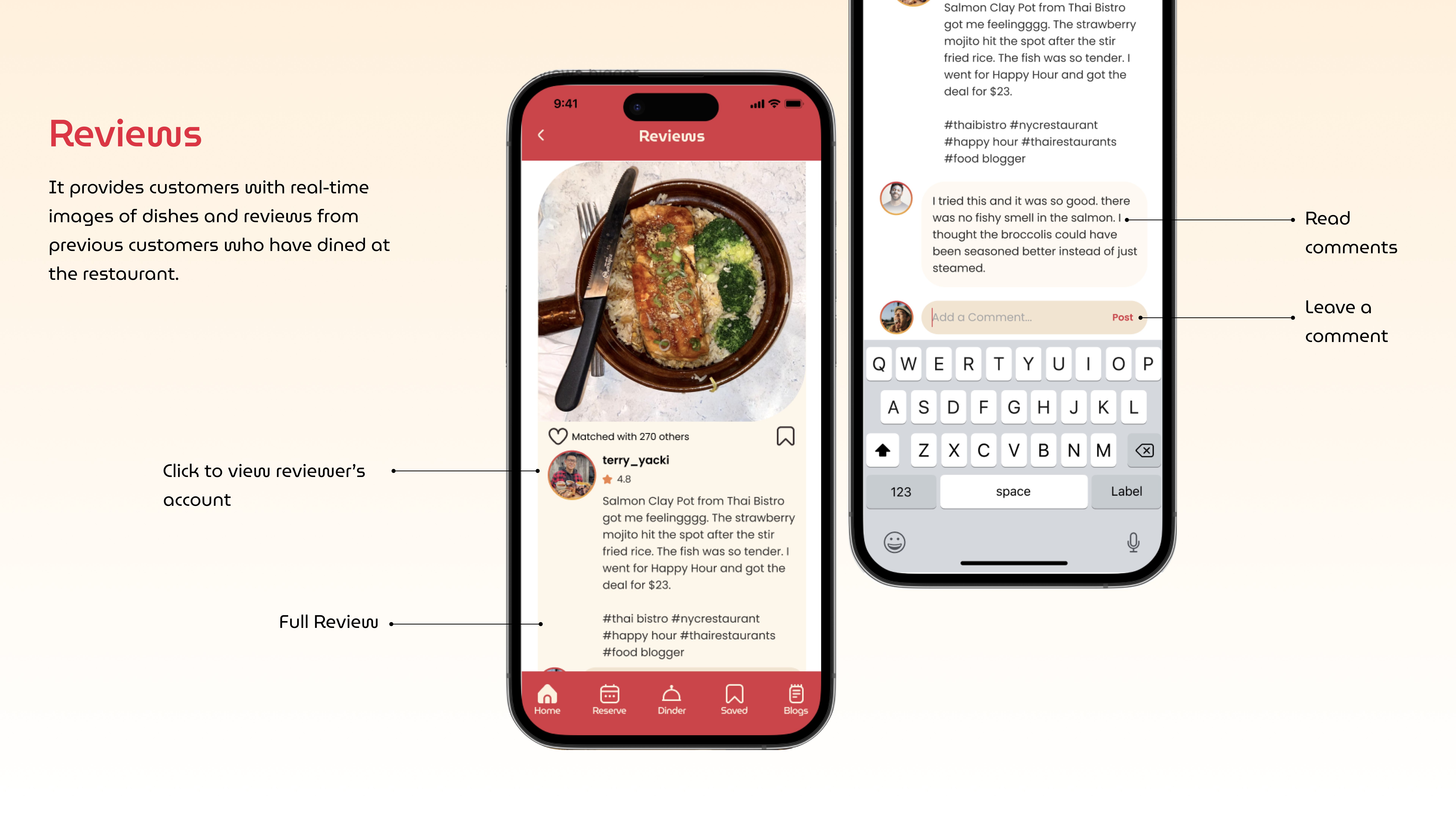
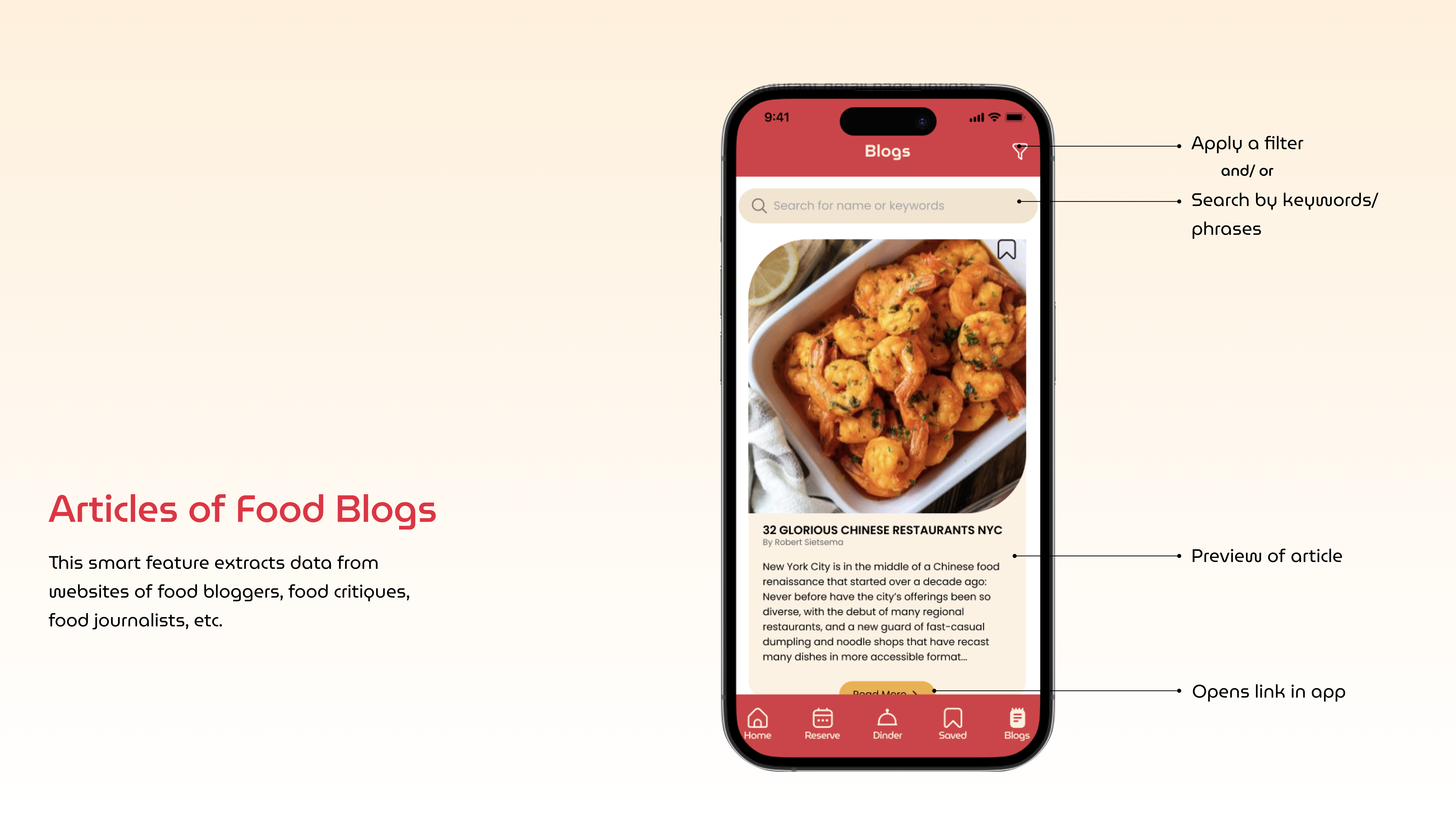
Table Talk brings authentic voices into the discovery experience by surfacing real opinions from social platforms alongside restaurant listings. Instead of relying solely on ratings, users can explore candid reactions, photos, and commentary from real people to build trust and confidence while browsing. This approach helps decisions feel more human, transparent, and grounded in lived experience.
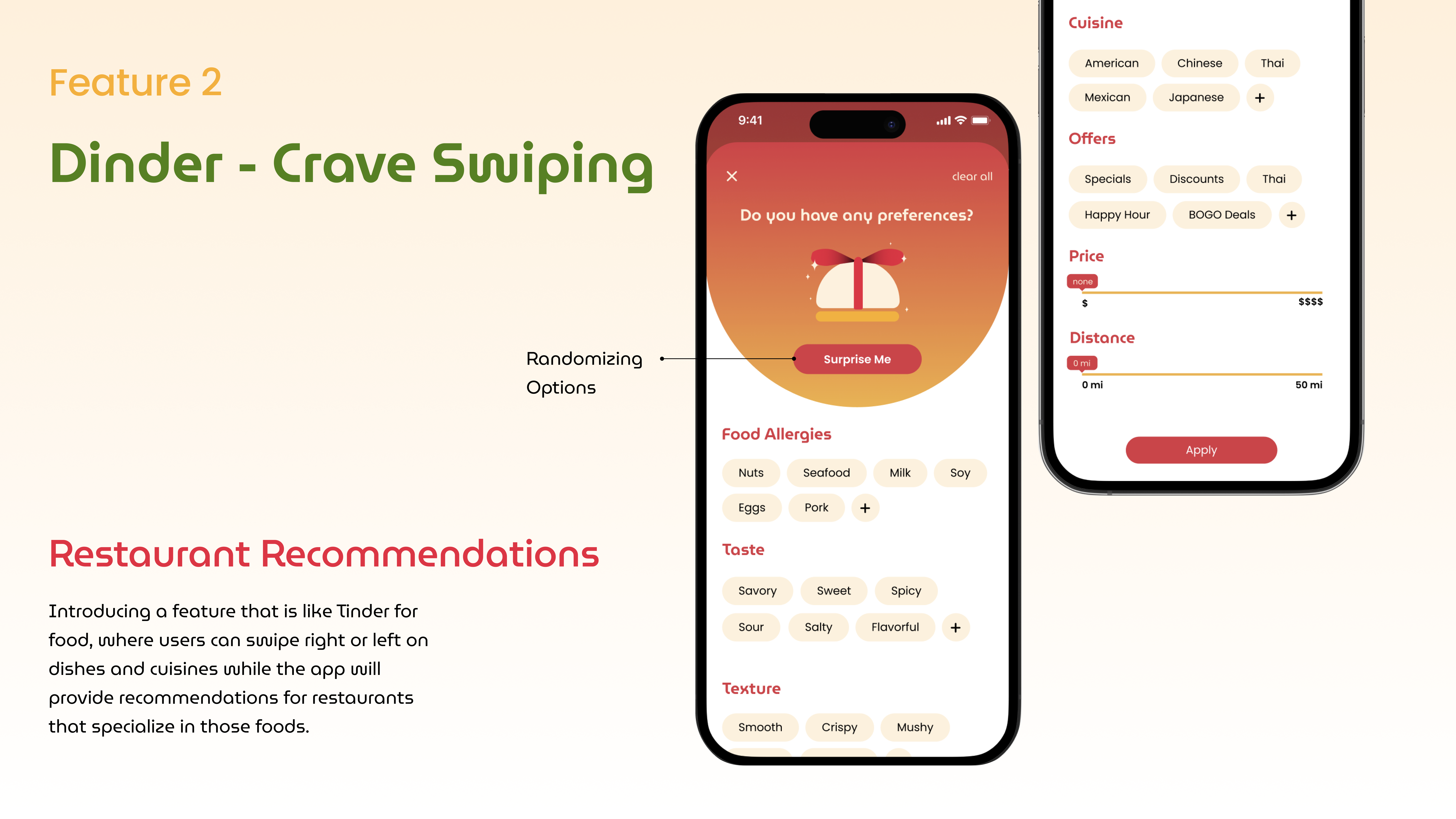
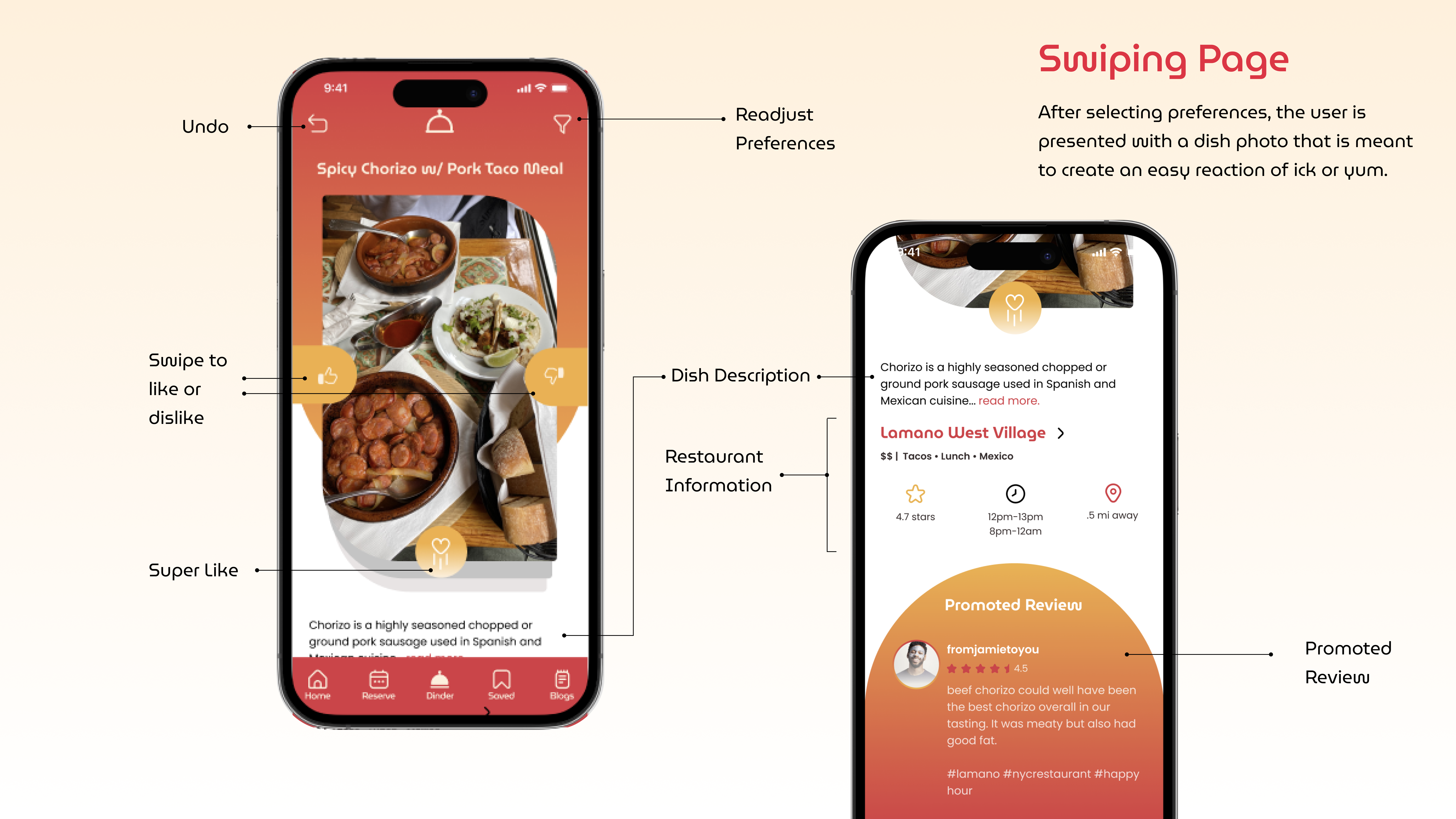
Dinder transforms food discovery into a visual, swipe based experience inspired by how people naturally browse today. By learning from user interactions and preferences, it quickly surfaces dishes and restaurants that match current cravings, helping users move from indecision to action with less effort and more confidence.
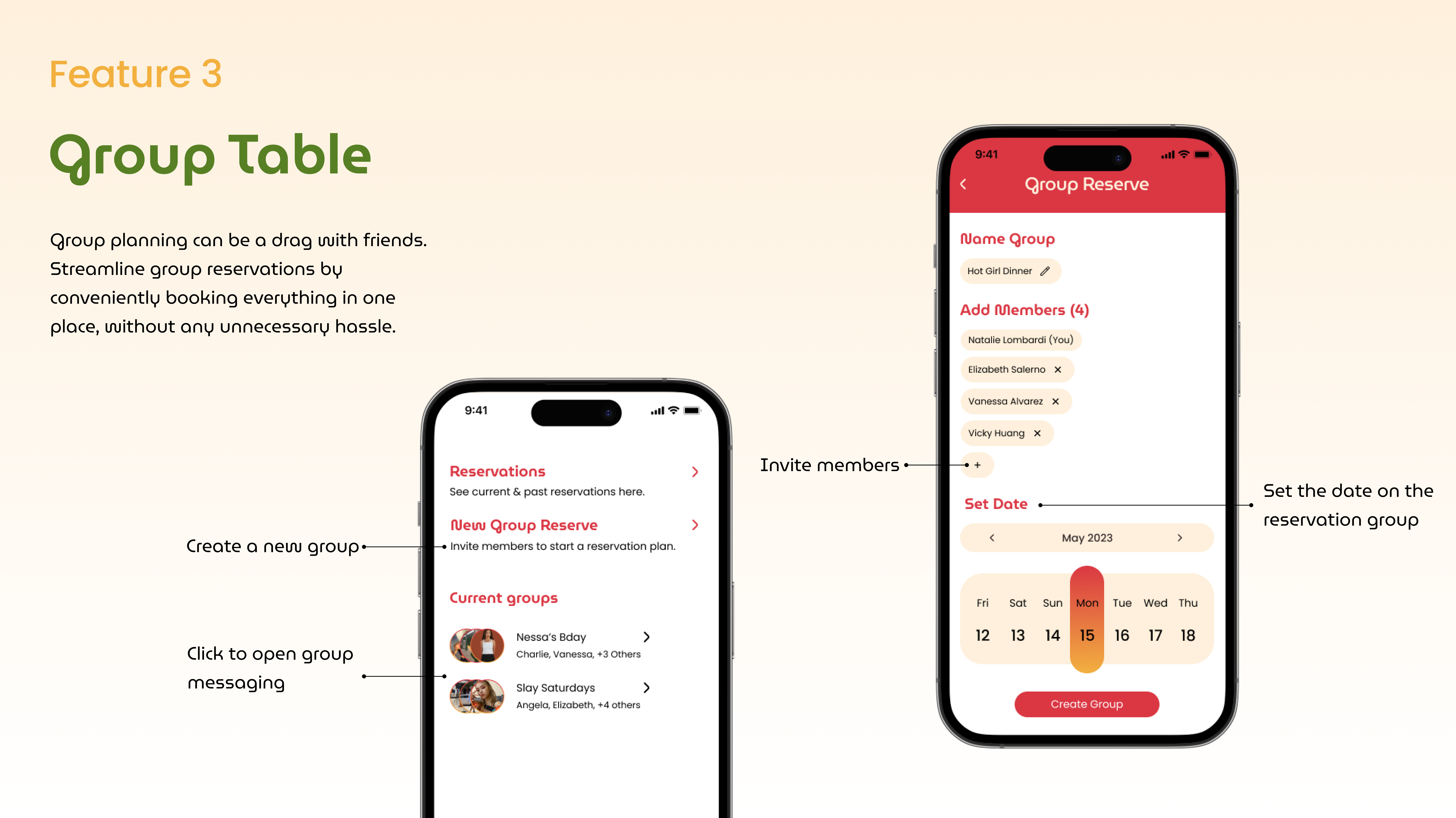
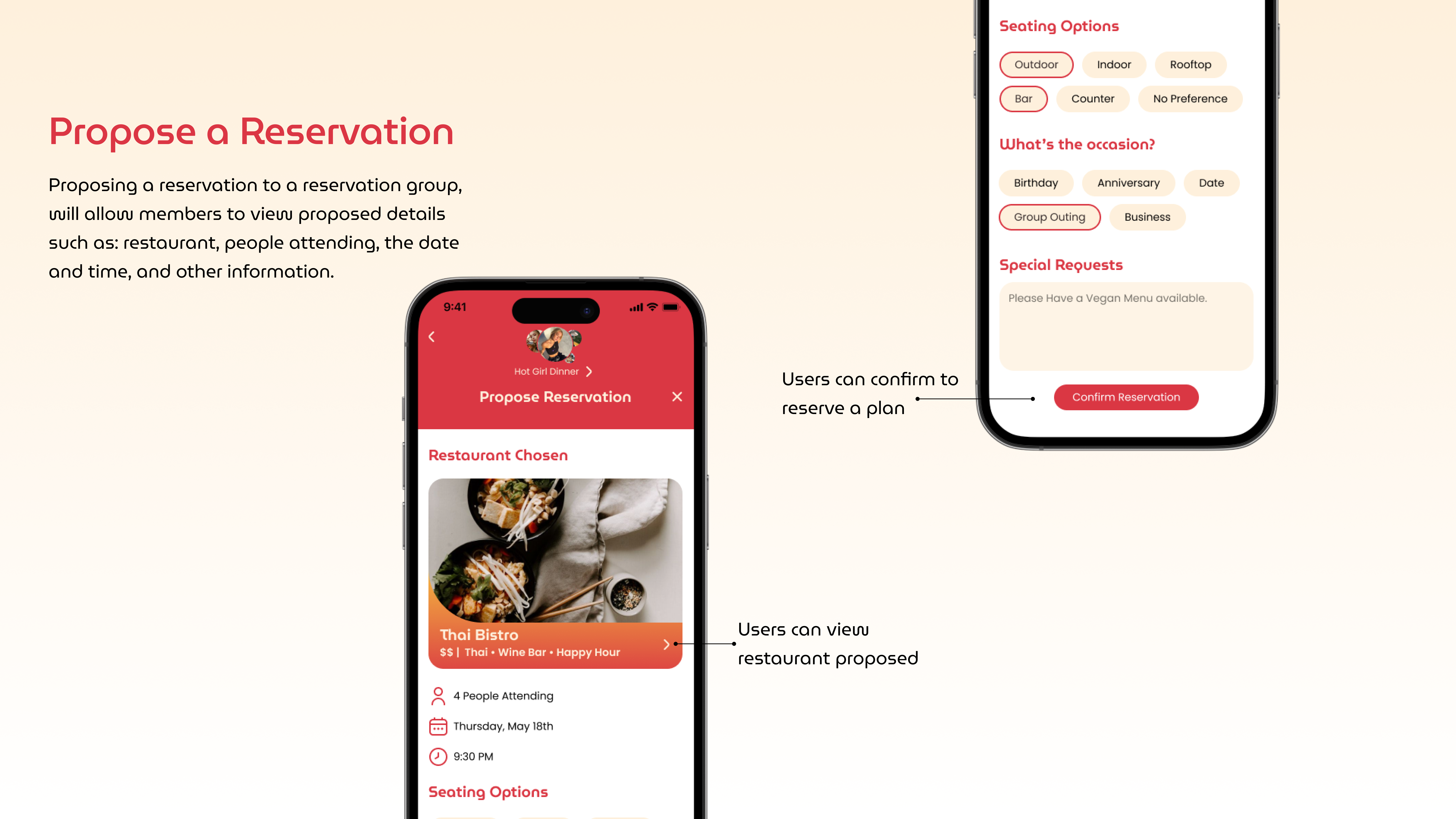
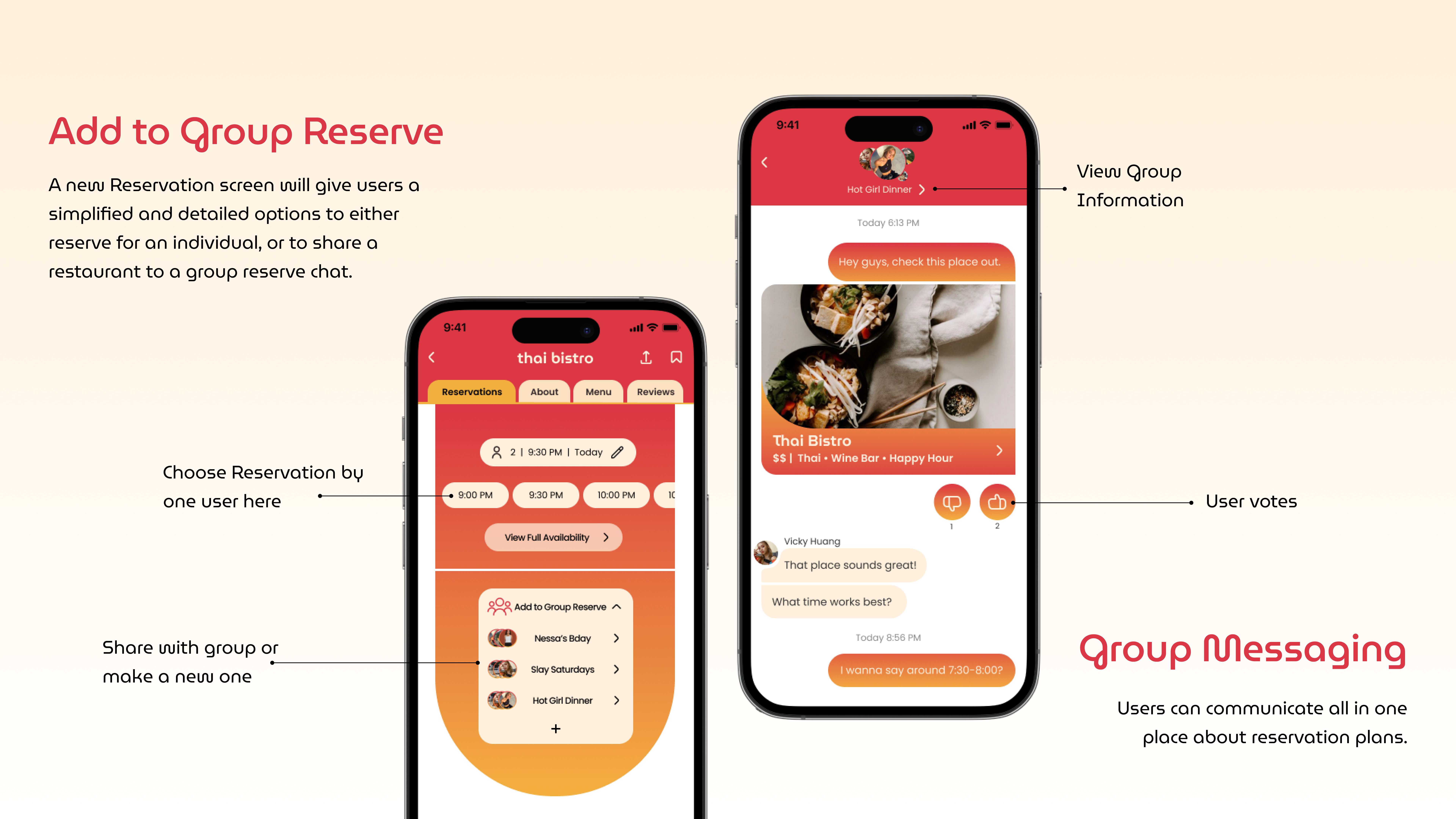
Group Table simplifies planning meals with friends by centralizing discovery, discussion, and decision making in one shared space. Users can explore options together, react to suggestions, and align on availability and preferences, reducing back and forth and making group dining easier and more enjoyable.
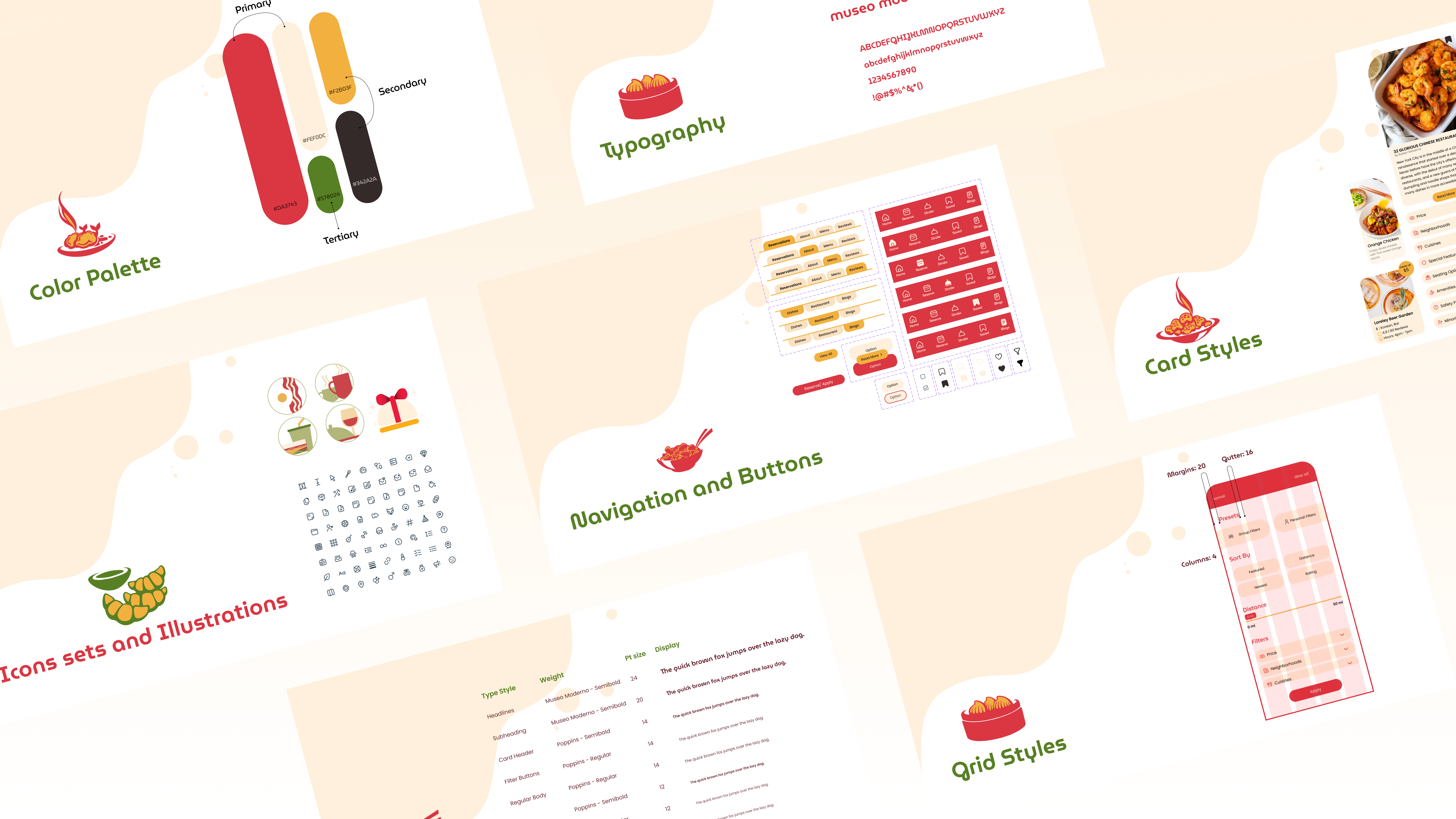
The design system brings consistency and flexibility to the experience while allowing personality to shine through. Inspired by the mood board, it uses warm color palettes, expressive imagery, rounded typography, and organic shapes to create an inviting, food forward aesthetic. Modular components and clear hierarchy ensure the system scales across features like discovery, social content, and group planning while maintaining clarity, usability, and visual cohesion.
Bringing together discovery, social context, and group planning into a single experience highlighted the importance of clarity, consistency, and trust throughout the user journey. Research driven insights shaped interaction patterns that reduced decision fatigue while supporting more confident, emotionally informed choices. Ongoing collaboration across ideation, testing, and iteration ensured concepts stayed grounded in real user needs as complexity increased.
Next steps include designing lightweight onboarding flows to better introduce new interaction models and educate users on key features such as swipe based discovery, social reviews, and group planning. Additional refinement of system feedback, personalization, and collaborative decision states will help strengthen usability and adoption as the product continues to evolve.

