

A refined and elevated ecommerce experience that highlights iconic
products while streamlining browsing, discovery, and conversion.
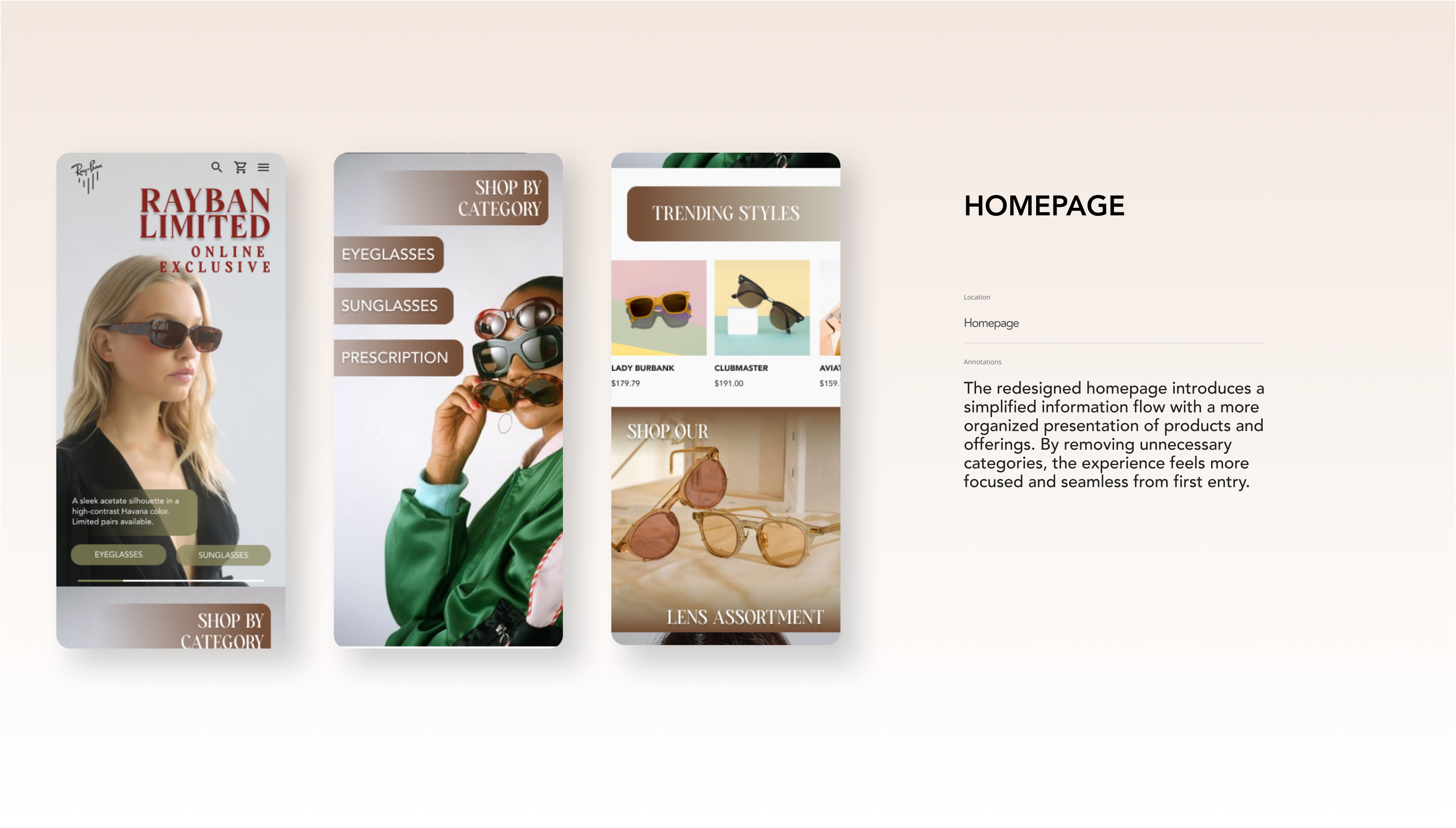
The RayBan ecommerce experience faced several challenges, including unclear visual hierarchy in navigation, static product imagery that failed to engage, and homepage layouts that lacked focus. The goal of this redesign was to create a more mobile friendly, intuitive, and visually compelling site that puts iconic products at the forefront and makes browsing effortless across devices.
Cluttered. Unfocused. Inefficient.
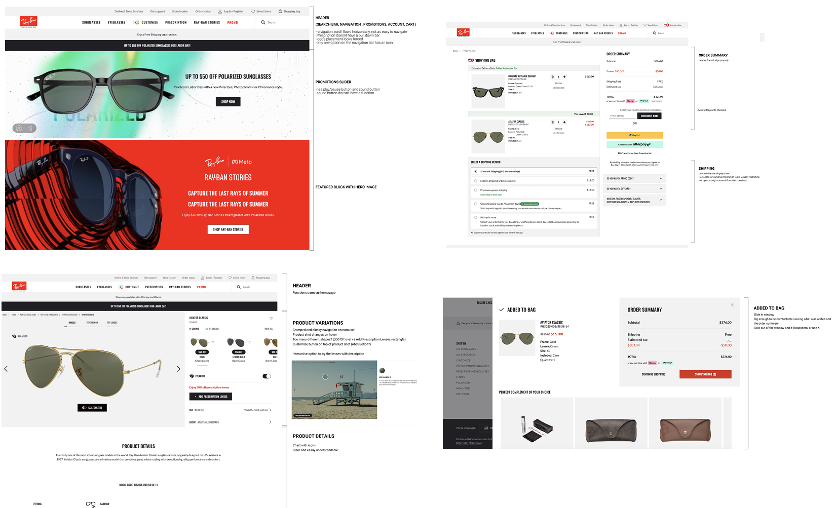
Users encountered visual clutter and poor hierarchy in the navigation system, making it difficult to orient themselves or quickly find products. The existing product photography lacked energy and appeal, and the homepage overwhelmed users with too much information and too little direction.
We began by understanding the core pain points in browsing and product discovery. Wireframes were developed to test improved information flow and product prioritization before moving into UI design. Emphasis was placed on simplifying navigation, reducing cognitive load, and elevating visual engagement through dynamic branding elements. These foundational decisions allowed the design system to support consistency while giving space for expressive product storytelling.
RayBan targets style conscious individuals seeking eyewear that balances fashion, function, and self expression. The audience includes men and women aged 20–50 who value iconic design, customization, and quality craftsmanship. This group is driven by individuality and cultural influence, often drawn to music, art, and fashion as extensions of personal identity.
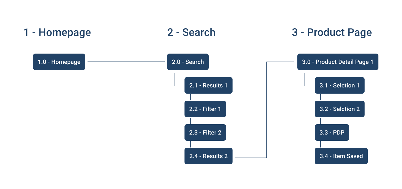
We conducted a comprehensive taskflow audit across key RayBan ecommerce touchpoints, including the homepage, product listing pages, product detail pages, and checkout flow. The audit focused on layout structure, visual hierarchy, component consistency, and how effectively the interface guided users from discovery to conversion.
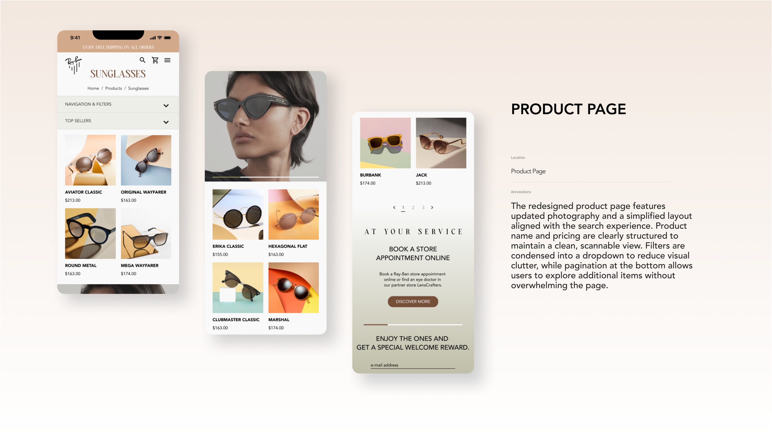
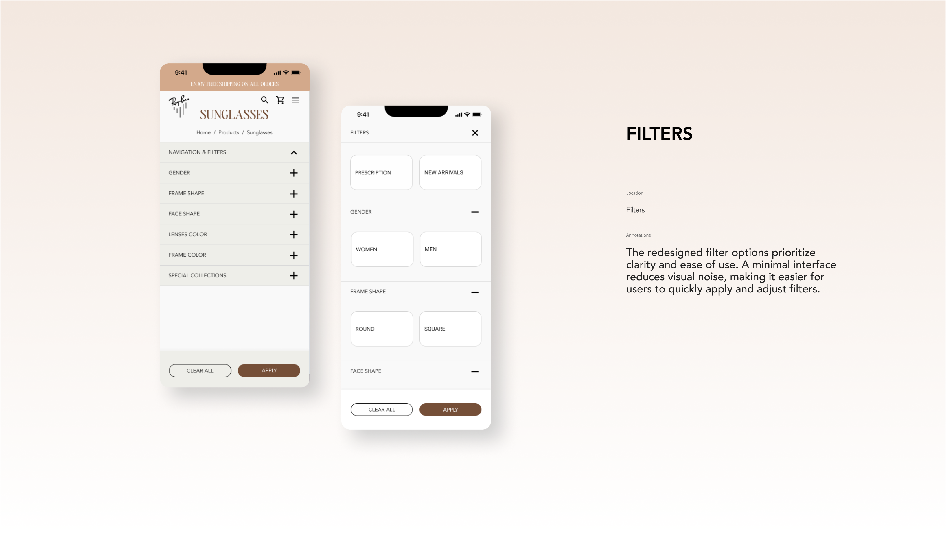
Across screens, we identified opportunities to reduce visual density, clarify hierarchy, and simplify decision making during product selection. Inconsistent spacing, competing calls to action, and information heavy product pages created moments of friction, particularly for users browsing multiple frames or customizing options.
Insights from the audit informed refinements to layout patterns, filter presentation, and product detail organization. By streamlining components and prioritizing the most critical information at each step, the redesign aimed to create a more focused, intuitive, and visually elevated shopping experience.

To inform the RayBan UI redesign, we analyzed leading eyewear brands with a focus on interface clarity, visual hierarchy, typography, and component usage.
Oliver Peoples conveyed luxury through restrained layouts and refined typography, though the interface lacked visual energy. Oakley delivered bold, high impact layouts that emphasized performance but could feel visually dense. Warby Parker focused on simplicity and accessibility, resulting in an approachable interface that felt less elevated for a luxury brand.
This analysis revealed a clear opportunity for RayBan to balance iconic brand expression with modern UI clarity. By combining editorial storytelling, dynamic visual hierarchy, and consistent, scalable components, the redesign aimed to create an interface that feels premium, engaging, and effortless to navigate.
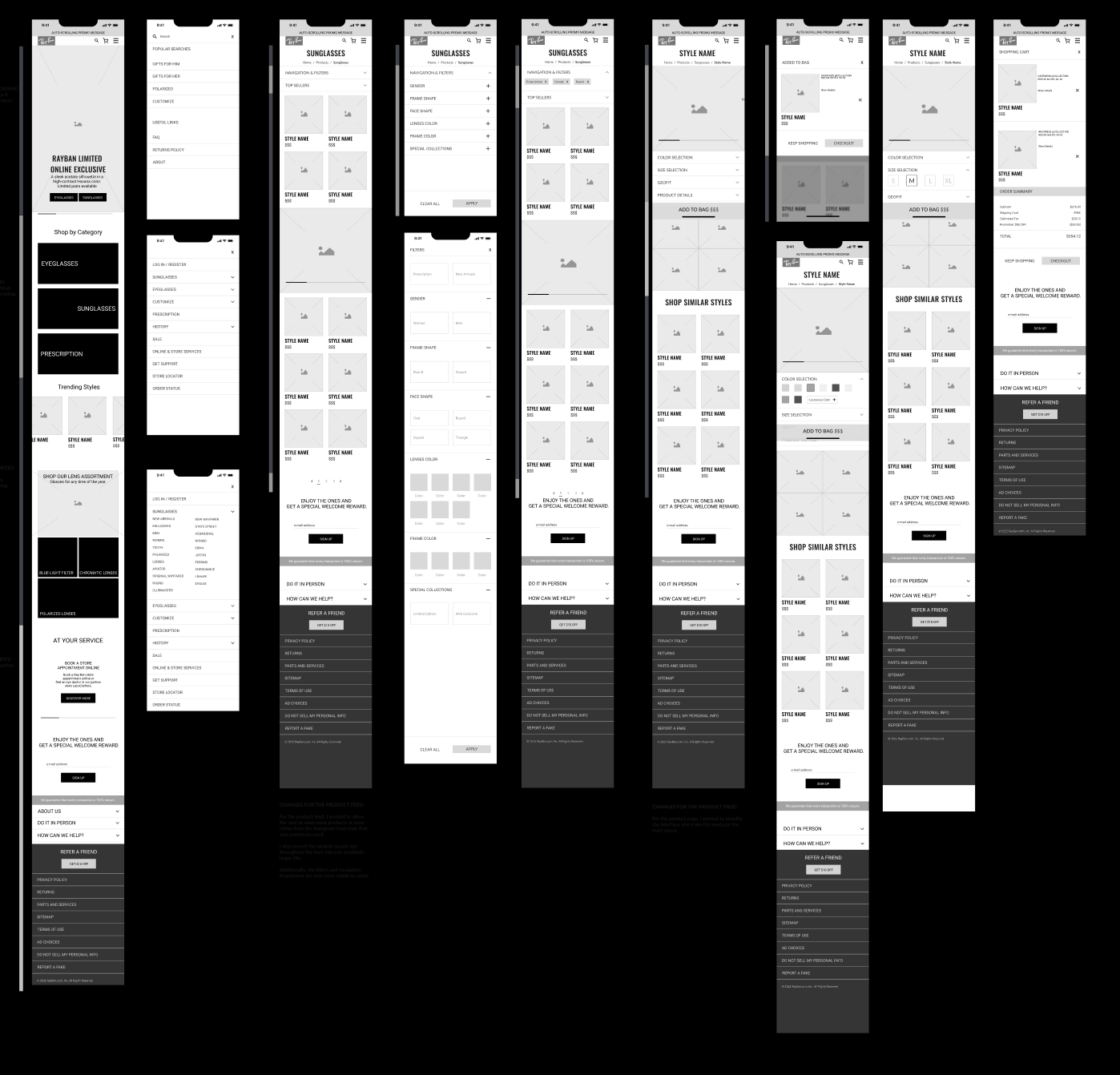
We created low fidelity wireframes and interactive prototypes to explore layout, hierarchy, and key interactions across core user flows. Prototyping allowed us to validate assumptions, test usability early, and iterate quickly based on feedback before moving into detailed design.
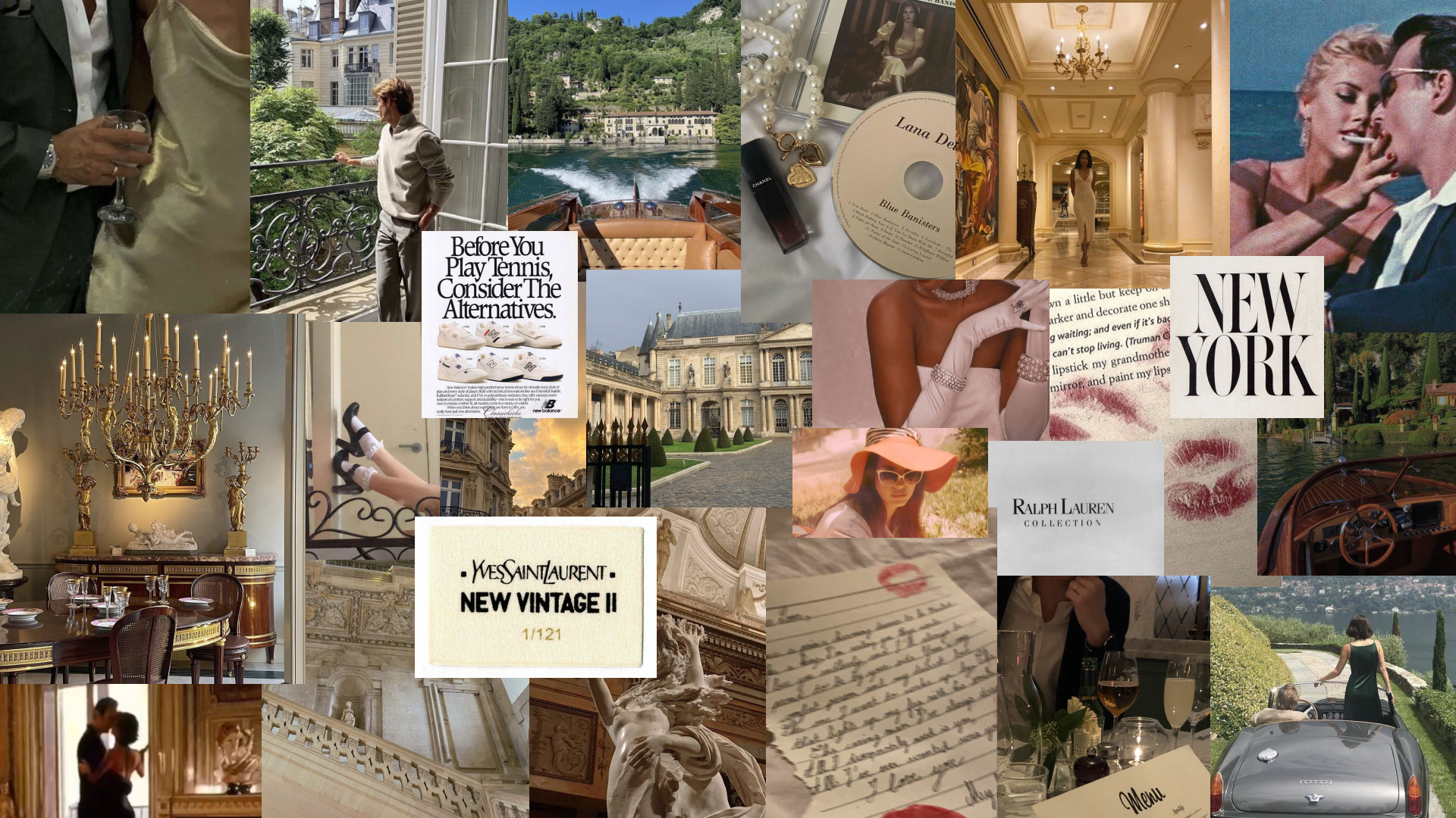
The detailed design phase translated the Old Money visual direction into a refined, modern interface. Warm neutrals, muted contrast, and timeless typography established a sense of sophistication, while structured layouts and intentional spacing reinforced clarity and hierarchy. Brand archetypes such as The Lover and The Explorer guided visual tone, balancing emotional appeal with confidence and restraint.
Imagery, color, and component styling were used to elevate product presentation without overwhelming the interface, resulting in a design that feels iconic, composed, and unmistakably Ray-Ban.
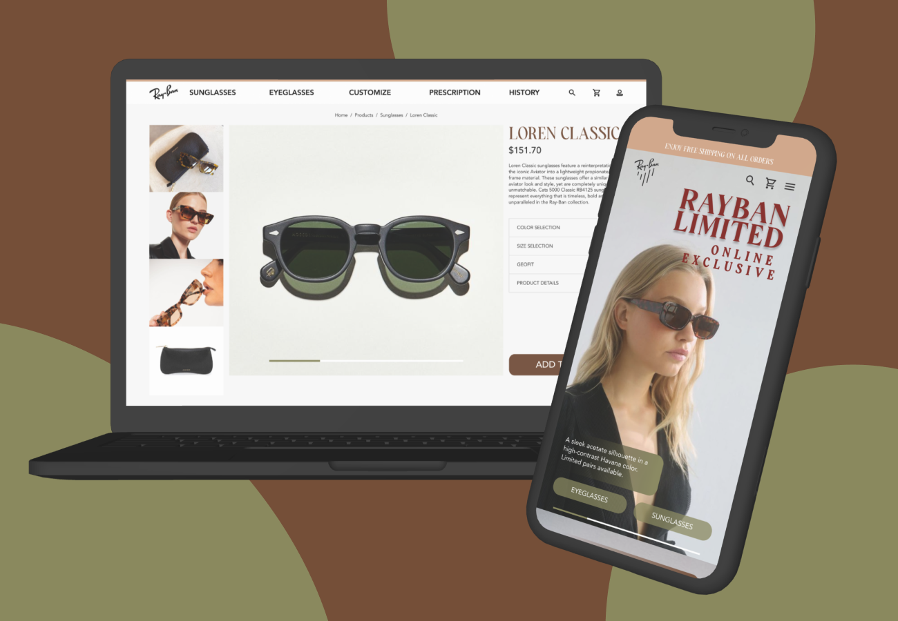
The mobile experience prioritizes simplicity and ease of use, presenting key product information in a focused, vertically driven layout. Content is streamlined to reduce cognitive load while supporting quick browsing, filtering, and decision making on smaller screens.
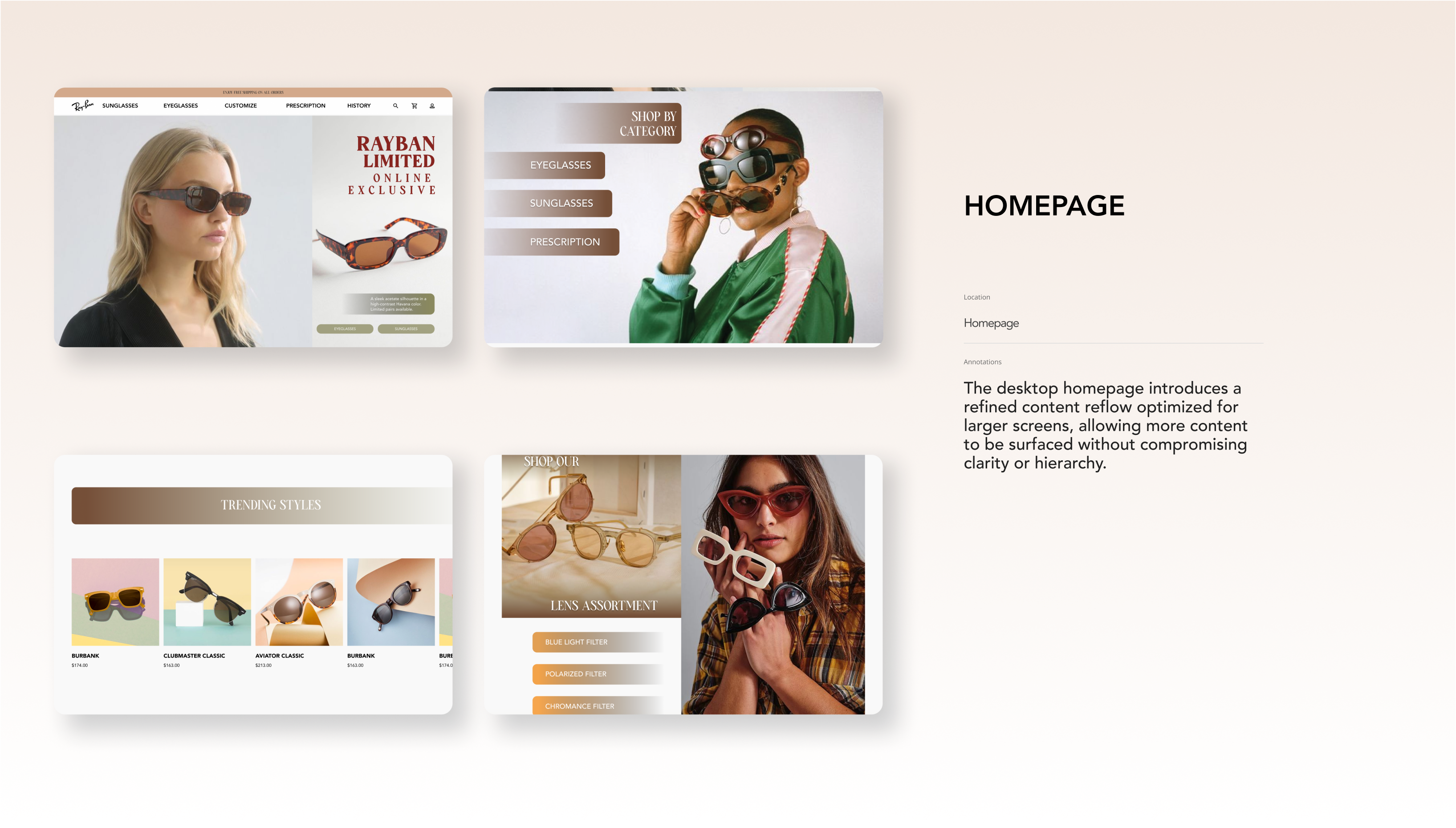
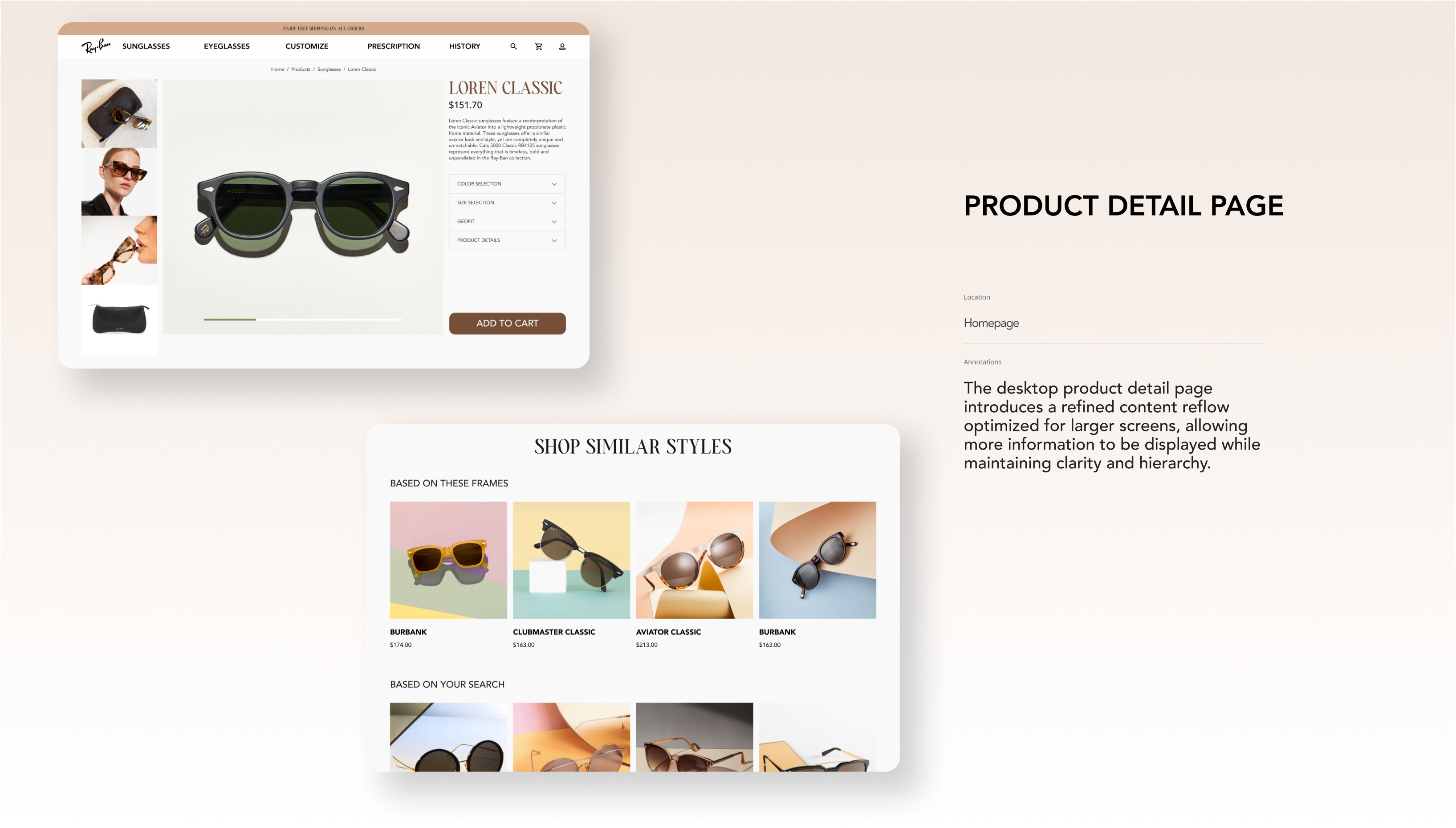
The desktop experience takes advantage of larger screen space through a refined content reflow that surfaces more information at once. Clear hierarchy, spacing, and layout structure support deeper exploration while maintaining a clean and organized interface.
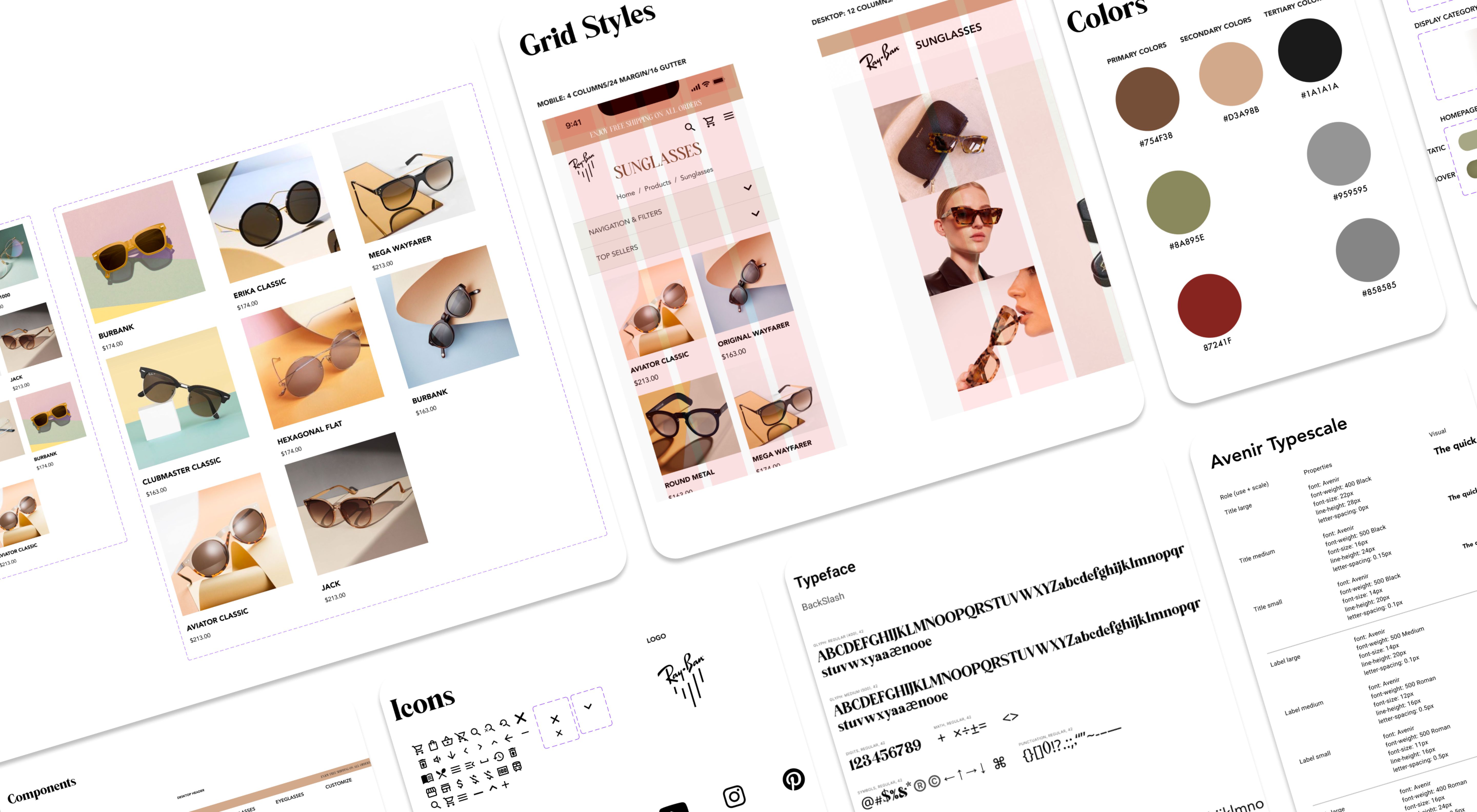
The design system establishes a cohesive visual foundation that balances timeless brand expression with modern UI clarity. Inspired by the mood board, it uses warm neutrals, refined typography, and intentional spacing to create a premium, composed aesthetic. Modular components and consistent layout patterns ensure scalability across pages while maintaining visual hierarchy and usability.
The redesign clarified RayBan’s ecommerce experience by strengthening visual hierarchy and simplifying navigation across key pages. A more focused homepage and streamlined product listings reduced cognitive load and helped users engage with products more intentionally. The updated visual direction elevated product storytelling while remaining true to RayBan’s iconic brand identity, creating a browsing experience that feels both timeless and modern.
Future iterations would continue refining the experience through motion and micro interactions to add depth and feedback without compromising simplicity. Expanding the design system to support additional product categories and personalization features would allow the platform to scale more effectively. Further usability testing could validate refinements across mobile and desktop, ensuring the experience remains intuitive as new features and content are introduced.

